
Sample Category Title
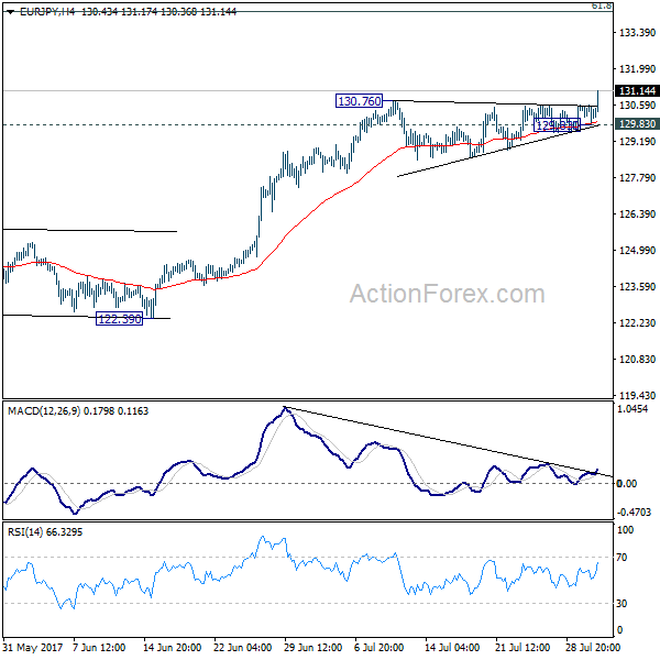
EUR/JPY Daily Outlook
Daily Pivots: (S1) 129.87; (P) 130.23; (R1) 130.63; More...
EUR/JPY's rally resumes by taking out 130.76 and reaches as high as 131.17 so far. Intraday bias is back on the upside. Current rise should now target next long term fibonacci level at 134.20. On the downside, break of 129.83 support is needed to indicate short term topping. Otherwise, outlook will remain bullish in case of retreat.
In the bigger picture, the down trend from 149.76 (2014 high) is completed at 109.03 (2016 low). Current rally from 109.03 should be at the same degree as the fall from 149.76 to 109.03. Further rise is expected to 61.8% retracement of 149.76 to 109.03 at 134.20. Sustained break there will pave the way to key long term resistance zone at 141.04/149.76. Medium term outlook will remain bullish as long as 125.80 resistance turned support holds.
EUR/JPY Breakout as Markets Eye DAX, Oil Pullback Lifts USD/CAD
Yen falls sharply in Asian session on risk appetite flows. Strong earnings from Japanese companies lifted Nikkei back above 20000 handle as the index is trading up 0.6% at the time of writing. That followed another record close in DOW overnight, at 21963.92, up 0.33%. Euro is benefiting most from the developments, in particular, with EUR/JPY finally taking out 130.76 resistance to resume recent rally. Markets will have an eye on German DAX today, which rebound by 1.1% yesterday. That mark the complete of a recent correction and if that's the case, strength in DAX would likely support the Euro further. Meanwhile, Dollar also recovers mildly today, against most except Euro as markets await ADP private employment data from US. Talking about employment, New Zealand Dollar is trading as the weakest one as dragged down by Q2 job data.
DAX could have finished pull back
DAX recover strongly after drawing support from medium term channel. It was also kept slightly above key cluster support at 11941.57, 38.2% retracement of 10402.59 to 12951.54 at 11977.84, as well as 12000 psychological level. Focus is now back on 12341.03 resistance. Break will suggest that the correction from 12951.53 has completed. And in that case, further rise would be seen back to retest 12951.54 later in the quarter. Such development would be Euro supportive.

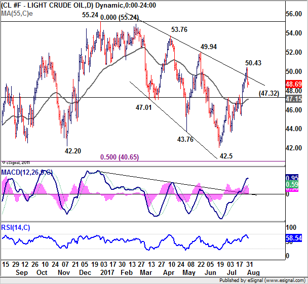
Oil failed 50, lifting USD/CAD
Oil price is another one to watch today. WTI reached as high as 50.43 earlier this week but failed to sustain above 50 handle. It's now back below 49. The development is lifting USD/CAD through 1.2575 resistance. This signals that USD/CAD has bottomed at 1.2412 in near term after drawing support from 1.2460 key support level. As long as WTI stays above 47.32 in the current pull back, rebound in USD/CAD should be limited. But break of 47.32 in oil will possibly send USD/CAD back towards 1.3 handle in a larger scale corrective rebound.
BoJ Funo urges structural reforms
BoJ board member Yukitoshi Funo reiterated the central bank's stance that "powerful" monetary stimulus should be maintained to boost inflation, which is far below target. But he emphasized that monetary stimulus alone is not enough and called for structural reforms. He said that "japan's economy still has room to raise productivity when seen from a global perspective." And, "now is a good chance to proceed with structural reforms and growth strategies, because monetary conditions are very loose and the job market is tight." He is optimistic that a strong economy and a tightening job market will likely gradually push up wages and inflation.
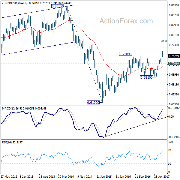
Kiwi lower as employment shrank in Q2
New Zealand employment dropped -0.2% qoq in Q2, much weaker than expectation of 0.7% qoq rise. Unemployment rate dropped to 4.8%, down from 4.9%. Private sector labor cost rose 0.4% qoq, in line with consensus. The data affirmed RBNZ's stance to stand pat in the environment of global policy stimulus exit. NZD/USD dips notable today to 0.7420 and the development confirms short term topping at 0.7553 last week. But overall, there is no change in the bullish outlook. NZD/USD is now in short term consolidation and could dip lower. But downside should be contained by 0.7201 support to bring another rise. Rise from 0.6816 is seen as resuming the medium term rebound from 0.6102. Another rally is expected to 61.8% retracement of 0.8835 to 0.6102 at 0.7791 next.
US ADP to highlight the day
Also released earlier today, Australia building approvals rose 10.9% mom in June. Japan monetary base rose 15.6% yoy in July. UK BRC shop price index dropped -0.4% yoy in July. Swiss will release a bunch of data today including SECO consumer confidence, SVME PMI and retail sales. UK will release construction PMI. Eurozone will release PPI. US ADP private employment will be the main focus of the day.
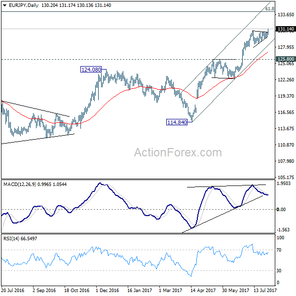
EUR/JPY Daily Outlook
Daily Pivots: (S1) 129.87; (P) 130.23; (R1) 130.63; More...
EUR/JPY's rally resumes by taking out 130.76 and reaches as high as 131.17 so far. Intraday bias is back on the upside. Current rise should now target next long term fibonacci level at 134.20. On the downside, break of 129.83 support is needed to indicate short term topping. Otherwise, outlook will remain bullish in case of retreat.
In the bigger picture, the down trend from 149.76 (2014 high) is completed at 109.03 (2016 low). Current rally from 109.03 should be at the same degree as the fall from 149.76 to 109.03. Further rise is expected to 61.8% retracement of 149.76 to 109.03 at 134.20. Sustained break there will pave the way to key long term resistance zone at 141.04/149.76. Medium term outlook will remain bullish as long as 125.80 resistance turned support holds.
Economic Indicators Update
| GMT | Ccy | Events | Actual | Forecast | Previous | Revised |
|---|---|---|---|---|---|---|
| 22:45 | NZD | Unemployment Rate Q2 | 4.80% | 4.80% | 4.90% | |
| 22:45 | NZD | Employment Change Q/Q Q2 | -0.20% | 0.70% | 1.20% | 1.10% |
| 22:45 | NZD | Labor Cost Private Sector Q/Q Q2 | 0.40% | 0.40% | 0.40% | |
| 23:01 | GBP | BRC Shop Price Index Y/Y Jul | -0.40% | -0.30% | ||
| 23:50 | JPY | Monetary Base Y/Y Jul | 15.60% | 16.60% | 17.00% | |
| 1:30 | AUD | Building Approvals M/M Jun | 10.90% | 1.00% | -5.60% | -5.40% |
| 5:00 | JPY | Consumer Confidence Index Jul | 43.5 | 43.3 | ||
| 5:45 | CHF | SECO Consumer Confidence Jul | -3 | -8 | ||
| 7:15 | CHF | Retail Sales (Real) Y/Y Jun | 1.30% | -0.30% | ||
| 7:30 | CHF | SVME PMI Jul | 58.8 | 60.1 | ||
| 8:30 | GBP | Construction PMI Jul | 54 | 54.8 | ||
| 9:00 | EUR | Eurozone PPI M/M Jun | -0.10% | -0.40% | ||
| 9:00 | EUR | Eurozone PPI Y/Y Jun | 2.40% | 3.30% | ||
| 12:15 | USD | ADP Employment Change Jul | 190K | 158K | ||
| 14:30 | USD | Crude Oil Inventories | -7.2M |
Market Morning Briefing: RBI Today To Determine The Near Term Path For Rupee While BOE Tomorrow
STOCKS
Dow (21963.92, +0.33%) is moving up in line with our expectation and could move higher towards 22100-22250 in the medium term before seeing a corrective dip to 21750. Near term looks potentially bullish.
Dax (12251.29, +1.10%) rose well from the support that we have been mentioning for the last couple of days and the index has risen to 12300 as expected. The current rise may continue towards 12400-12500 before a pause is seen. There is some room on the upside for the coming sessions. .
Shanghai (3289.11, -0.11%) is trading near previous highs of 3288 and 3295 seen in Nov'16 and Apr'17 respectively. In case 3300 acts acts as a decent support, we could see a rise towards 3325-3350 in the next few sessions; else a corrective fall could start from current levels.
Nikkei (20069.88, +0.42%) continues to trade within 19700-20280 levels and unless there is a break out on either side of this range, it is difficult to get any directional clarity for the medium term. We wait for a clear directional signal with some bullish bias for the near term.
Nifty (10114.65, +0.37%) has closed near important resistance near 10115 and could possibly see some correction in the next few sessions before again trying to move up. Overall the long term uptrend is intact.
COMMODITIES
Gold (1266) is still struggling to rise above the 1270-75 regions and only a break above that may open up the higher target of 1290. Crucial supports are poised at 1260 and 1245 levels. We are not confident about the sustainability beyond 1270 regions due to short term overbought condition. In case the Support at 1245 breaks, there will be a further dip to 1230 and 1210 levels respectively.Silver (16.61) somehow manages to hold above 16.50 levels, but a close below 16.50 could open up 16.20 and 15.90 levels respectively. We might see significant fall in Silver if there will be any short term price correction in Copper.
Copper (2.87) is hovering around 2.90 levels. We might see price correction towards 2.78-80 levels due to short term overbought condition. But we will remain bullish on Copper in midterm time frame while it s trading above 2.70-75 regions.
This is the 6th consecutive week when market is anticipating a fall (-3.2M B) in weekly U.S crude oil inventory.If the anticipation of shortage will match the actual outcome (8:00 PM IST) then that could be beneficial for the ongoing bullish trend in Brent (52.63) and WTI (48.70). We will remain bullish on Brent and WTI, while they are trading above 48.70 and 45.50 levels on an weekly closing basis. But a surplus in U.S oil inventory could bring near term bearish possibilities into consideration.
Gold-WTI ratio (25.23) had broken the crucial support at 25.90-92 and came down. At the same time, Brent-WTI ratio (2.46) also had found support at 2.16 and moved higher. Both the ratios had moved in line with our expectation (dated 28th July 2017) so far.
FOREX
RBI today to determine the near term path for Rupee while BOE tomorrow and US NFP data on Friday to set the path of the majors this week.
Little change in the market for Dollar Index (93.10) and Euro (1.1803) as both remain in a minor consolidation phase at their respective extreme ends. The downside target of 92.00 for Dollar and upside target of 1.20 for Euro remains unchanged.
Dollar-Yen (110.54) is testing the resistance of 110.50-80 but even a rise above the resistance may not push it above 111.00-10. The downtrend is likely to resume by the end of the week with the downside target/support staying the same at 109.50.
Pound (1.3202) is wandering about the resistance of 1.3200 waiting for the BOE decision tomorrow. If the current pause phase stays limited to 1.3170 to the downside, the bullish momentum remains intact which may take it to 1.3330 and even 1.3420.
Aussie (0.7950) has entered a corrective phase even after the RBA held rates as expected. If the support at 0.7900-0.7875 holds, it may see a sharp bounce back above 0.80 levels. Higher targets of 0.8100-70 will be negated only on a break below 0.7875.
Dollar Rupee (64.08) closed below 64.10 ahead of the RBI policy meet conclusion today which may determine the near term path. We don't expect any upside for Dollar Rupee till the resistance of 64.25-30 holds but the downside remains open. Initial target remains unchanged at 63.90.
INTEREST RATES
The US yields have come off slightly from levels seen yesterday. The 5YR (1.80%), 10YR (2.25%) and the 30YR (2.87%) are all trading lower from previous levels of 1.83%, 2.29% and 2.90% respectively.
The UK-US 10YR (-1.04%) has moved up from -1.06% seen yesterday. There is scope of testing -0.98% in the coming sessions which could take the Pound up towards 1.33.
The UK yields have started to rise after quite some time and we could expect some more rise in the coming sessions.
The Indian 10YR GOI (6.4450%) has bounced from support near 6.40% and could move up towards 6.50-6.55% in the next few sessions. Near term looks bullish.
Dollar Retreats From Multi-Year Low After Mixed PMI Data
The day's gain was never going to set the world alight, yet, in context of the losses seen in recent months, perhaps it should be happy with what it got
Manufacturing data broadly softened in July, which dragged the headline figure down -1.5 points to 56.3 (57.8 prior). This was slightly below expectations of 56.3 yet still relatively elevated compared with China and Japan.
The heaviest decline was from new orders which dropped -1.3 pts yet this remains elevated at 60.4. Prices provided the heaviest contribution which increased by 7 pts to leave the index at 62 (55 prior). So far for July we have seen prices spike for Japan, China and Australia as commodity prices have rallied. On the face of it this spell good news for inflationary pressures, so long as the costs are passed onto manufacturer's customer's and these rising prices are also absorbed by the consumer to raise realised and expected inflation. We are a long way off from confirming such a chain of event but every trend must start somewhere.
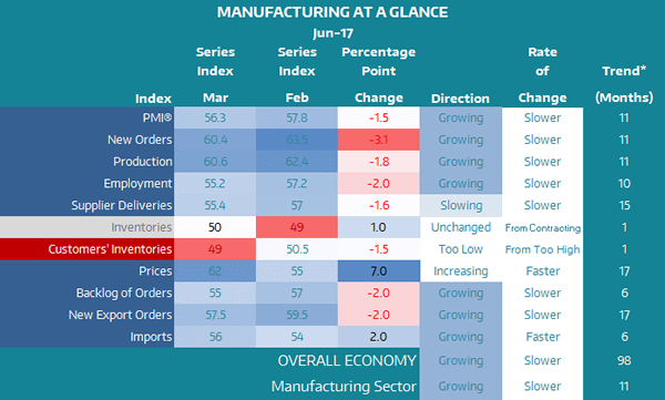
Where the ISM manufacturing data fell slightly below consensus, Markit PMI slightly beat forecasts. The 1.3-point gain is the fastest monthly expansion in 9 months and is strong enough to suggest a trough may have been seen.
Construction spending was a disappointment at -1.3%, it's 2nd lowest reading since October and completely missed expectations of 0.4% (0.3% prior). The Core personal consumption expenditure made up for this though by beating expectations of 1.3% and remaining at 1.5%.
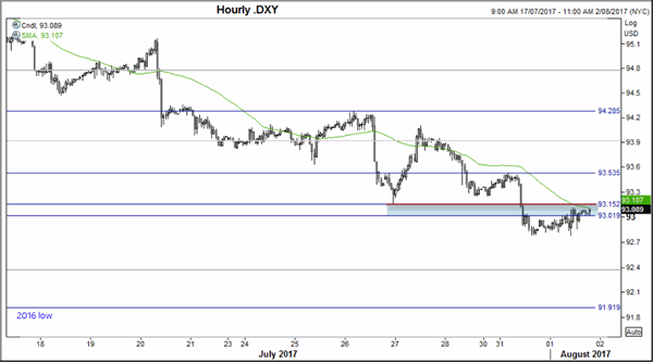
Whilst, overall the data was good by US standard this year, it was not enough to make a noteworthy dent on the Dollar's decline. Neither data from US or Europe convinced traders there was any urge for banks to tighten policies which saw money flow back into bonds and push yields lower.
93.15 is a pivotal area for H1 as it marks the 27th June low and sits near the 50-hour MA. Whilst a move above this resistance area may prompt a spike higher fuelled by stops triggering, price action from the low appears to be corrective show we cannot yet rule out another break to new lows whilst below the 93.53 swing high.
We see the AUDUSD is showing signs of weakness from the highs and is on the cusp of confirming a double top on H4. Price is back below the 80c level and provided a higher low overnight and a break higher for DXY assumes we may see follow-through of the bearish move on AUD.
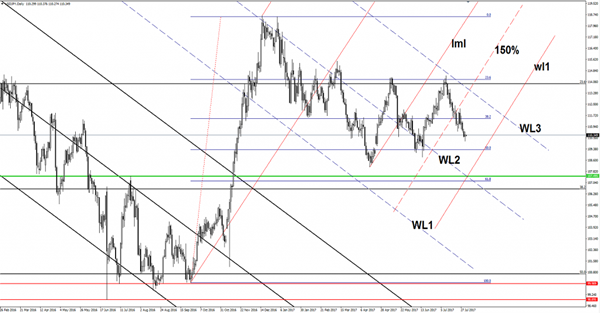
USD/JPY Losing Momentum
Continues to move in the range between the 23.6% and the 50% retracement levels. Personally, I still believe that will reach and retest the 50% retracement level and the warning line (wl1) of the ascending pitchfork. We’ll have a clear direction only after a valid breakout from this extended sideways movement.
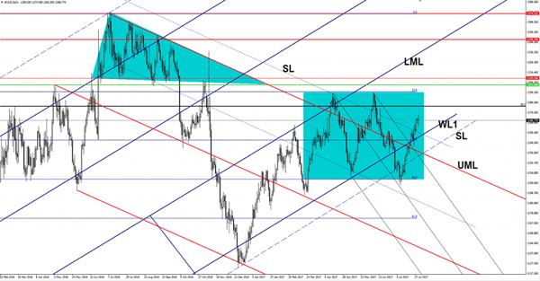
Gold Expected To Stabilize In The Green Zone
We had some volatility on Gold on Tuesday, but now looks undecided even if the perspective is bullish on the short term. Could shine further if the dollar index will hit new lows, it is expected to approach and reach the 38.2% retracement level and the 23.6% retracement level. A retest of the warning line (WL1) will bring us a good buying opportunity.
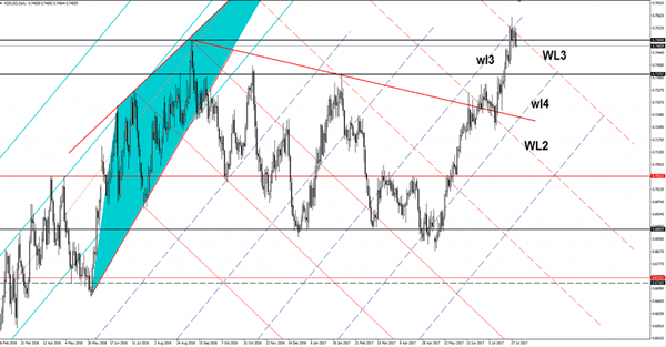
NZD/USD Turned To The Downside
Price dropped aggressively on Tuesday, erasing the Monday's gains, we may have a selling opportunity if will come back to retest the resistance levels. Technically should drop on the short term after a false breakout above a major confluence area. The USD has managed to drag the price down only because the dollar index has managed to increase a little and to jump above the 93.00 psychological level again.
Unfortunately, the USDX is still pressured on the Daily chart, could still approach and reach the 92.49 static support despite the yesterday's rebound.
You should know that the price will be driven by the fundamental factors later as the New Zealand is to release high impact data, the Employment Change could increase by 0.7% in Q2, while the Unemployment Rate could drop to 4.8%, from 4.9% in the second quarter. The Labor Cost Index may increase by 0.5%, more compared to the 0.4% growth in the former reading period. The US is to release the ADP Non-Farm Employment Change today, this event could bring a high volatility.
Price plunged in the last session and invalidated the breakout above the third warning line (WL3) of the major descending pitchfork. Now is trading under the 0.7484 static resistance, a retest of this level and the WL3 will bring us a perfect selling opportunity with first target at the 0.7375, the next one will be at the fourth warning line (wl4) of the former ascending pitchfork. I've said in the previous analysis that the perspective remains bullish as long as is trading above the wl4, a major drop will come only if it will take out the mentioned support. However a further increase will be confirmed only after a valid breakout above the WL3.
1MDB Rears Its Ugly Head
The 1MDB scandal rears its ugly head again and could dent sentiment in local Bond markets over the short term after 1MDB failed to make good on debt payments to Abu Dhabi sovereign wealth fund as part of a debt settlement dispute.
And while the regional geopolitical knock on from North Korea appears well contained further escalation will likely create unwanted local volatility and could spur capital outflows
But the USD MYR despite Political and Geopolitical spillovers could continue to push lower amidst broad USD weakness and stability of renminbi over the medium term. But over the short term, 1MDB headline consternation and the lack of overt USD selling suggest the USDMYR trades with a bid tone today, however, the pair is unlikely to press the 4.29 level. So far there has been little panic in the markets since Tuesday’s headline (1MDB) as there are still active buyers of Malay bonds
None the less, the local market is a bit jittery now but with global equity market trading at records highs and US treasury yields softening overnight, investor anxiety could be short lived.
However I think the MYR and other regional currency appeal is very much a USD storyline and provided the USD remains weak on a dovish Fed outlook, the MYR should stay in favour. However, a return of US fiscal policy to the headlines or a more aggressive Fed balance sheet initiative will present some serious headwinds to this view.
A Respite For The Greenback
A respite for the Greenback
Despite a break from the incessant waves of US dollar selling, there remains a skittish overtone in the currency markets as the fear of the unknown set’s in with US political uncertainty accentuating the current market unease. Treasuries traded down after a consensus PCE, but market sentiment quickly shifted driving prices up and yields down, as the market again emphasises the US political morass.
The US political crater and lack of fiscal stimulus from Washington will continue to be the primary catalyst for dollar declines. While the market is cautious about a possible USD risk reversal, searching for the key triggers are like looking for a black cat in a coal cellar.
US economic data had little impact on the December rate hike probabilities. But the fact remains investors believe the current political tumult in Washington will lessen the chances of another Federal Reserve rate hike in 2017
The perpetual Oil price roller coaster is adding to market jitters as WTI dropped 2.0% today on a Reuters report that OPEC production rose in July. Adding more fuel to the fire was the increase in US crude inventories reported by the American Petroleum Association at the end the NY session
Equities, on the other hand, continue to flourish as earning reports drive stocks to new highs. The Dow reached a new-all time high for a fifth consecutive session, nibbling at the key 22k mark
EURO
The Euro has traded marginally lower overnight but for the most part, has been trading sideways. The position overhang from month end activity with US payrolls around the corner has dealers adopting a more cautious tact as they look for more clues amidst the foggy US economic and political landscape.
Australian Dollar
While there was nothing particularly dovish in the RBA statement, there was also nothing that screamed AUD higher other than USD weakness. The Aussie has plunged lower overnight as the market is inferring that provided the currency remains elevated the RBA stays in the low-interest rate for the longer mode.
Japanese Yen
Very choppy session overnight as the Greenback traded with mixed sentiment. There was little news behind the overnight currency moves other than to speculate its a bout of nervous position nellies in summer thinned trading condition.
USD/CAD Canadian Dollar Lower Ahead Of US Private Jobs Report
The Canadian dollar gave back gains from the previous day as the turmoil surrounding the Trump Administration were given lower priority as the US employment releases this week will start with the release of the ADP on Wednesday.
The Canadian dollar has been appreciating against the USD since the Bank of Canada (BoC) changed the tone from neutral to hawkish in June. The central bank followed through with a 25 basis points rate hike in July. The loonie has taken advantage of USD softness as political uncertainty in Washington have impaired the greenback.
Canadian employment data will be released on Friday at the same time as the biggest indicator in the market, the U.S. non farm payrolls (NFP) at 8:30 am EDT. Canadian jobs have far exceeded expectations in the last two reports by quadrupling the forecast. Canada is forecasted to gain 11,000 jobs on Friday, but investors will be focused on American wages for signs of a pick up in inflation that would keep the Fed on the current path of rate hikes.
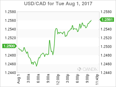
The USD/CAD gained 0.574 percent on Tuesday. The currency pair is trading at 1.2543 after the USD has recovered ahead of US jobs reports. Canadian data has boosted the loonie this year and the manufacturing purchasing managers’ index (PMI) rose to 55.5 earlier today. A strong first quarter could be followed by another solid gain that could keep pushing the currency higher.
The Bank of Canada (BoC) cut rates twice in 2015 to soften the blow to the economy from a drop in oil prices, but as crude has stabilized thanks to the efforts of the Organization of the Petroleum Exporting Countries (OPEC) the central bank had a quick turnaround in June and is now expected follow the July interest rate hike with another in October. The timing of the decision makes sense if the Canadian central bank wants to see if the Fed decides to start reducing stimulus in September and a Canadian rate rise could preempt a rate hike by the Fed in December
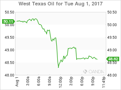
Oil prices lost 2.078 percent in the last 24 hours. West Texas Intermediate is trading at $49.06 as details of a rise in OPEC production as published by Reuters. The deal between major producers has kept prices in the current range, but there are cracks starting to appear on the sustainability of the agreement.
Saudi Arabia has capped production more than any member to cover the gap left by nations that could not cut as quickly or a deep. Disruption issues in Nigeria and Libya exempted the producers from participating but as they get close to recovery their production pressures prices.
Weekly oil reports have dictated the direction of energy prices as lower inventories have given way to a surge in oil prices, but demand remains stagnant limiting how high prices could really go.
Market events to watch this week:
Wednesday, August 2
4:30 am GBP Construction PMI
8:15 am USD ADP Non-Farm Employment Change
10:30 am USD Crude Oil Inventories
9:30pm AUD Trade Balance
Thursday, August 3
4:30 am GBP Services PMI
7:00 am GBP BOE Inflation Report
7:00 am GBP MPC Official Bank Rate Votes
7:00 am GBP Monetary Policy Summary
7:00 am GBP Official Bank Rate
7:30 am GBP BOE Gov Carney Speaks
8:30 am USD Unemployment Claims
10:00 am USD ISM Non-Manufacturing PMI
9:30 pm AUD RBA Monetary Policy Statement
9:30 pm AUD Retail Sales m/m
Friday, August 4
8:30 am CAD Employment Change
8:30 am CAD Trade Balance
8:30 am USD Average Hourly Earnings m/m
8:30 am USD Non-Farm Employment Change