
Sample Category Title
Introducing: Forex Swing Trading
What is Forex swing trading?
Swing trading simply describes a method of approaching the market where the trader is seeking to capture percentage moves in a currency pair, referred to as "swings". Trades taken in this manner are usually at a reduced position size to account for the large trade parameters and can last anywhere from a day to several weeks and are typically entered on the daily time frame and above though some traders so use the 4hr charts also.
This method of trading is distinctly different from other, more short-term approaches such as scalping where the trader looks to capture profits as quickly as possible and is usually only in the market for a few seconds to a few minutes looking to capture a very small amount of pips using a large position size to make the trade effective.
Why would traders choose this style of trading over other shorter term, more active types of trading?
One of the main benefits is the relatively small amount of time that swing trading requires compared to trading styles such as scalping. Typically swing traders will review the markets each night and track the daily closes placing trades each night when the daily candle closes. This is distinct from all forms of intraday trading where traders will be tracking price movements on charts as low as the 5 and 1 minute charts, but even on higher timeframes such as the 1 hour and 4 hour.
Using a swing trading approach on the daily timeframes gives traders much more time to plan their trades as moves take far longer to play out, and traders have more time to mark out their levels of engagement than if they were trading on the lower timeframes where intraday volatility, news releases can mean that trading is often fast and furious and traders have much less time to plan and execute their trades.
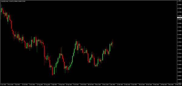
So, for example, a swing trader might look at a chart like this and think ok, the price has traded up to reach a prior high and we've put in a bearish candle. I think this is going to be a double top so I will set a short on the break of this bearish candle and I will hold the trade down to this swing low. So the trader will look to take the market from swing to swing - selling from the high, and holding it down to this low.
Once the trade is placed, the trade can simply check their chart each day to see how the market is moving or simply wait until either their stop or their target is hit.
So, in this instance, the trader is looking to capture a roughly 500 pip move. Whereas in a scenario like this for example. So here on the 5 minute chart the trader can identify a clear resistance level at this point and sees that the market is moving quite strongly up to it, so they might look to place a breakout trade targeting just a quick burst beyond that level, looking to bank 5 - 10 pips as price explodes out past the level.
So as you can see, these two approaches to the market are completely different and have totally separate objectives and motivations.
Now of course, for the majority of retail traders who work and have families, a swing trading approach fits perfectly into their schedules meaning that they don't have to be sat in front of their screens all day and can simply check the charts when they wake in the morning and or when they get home from work in the evening. For many traders, it can be hard to fathom that this type of trading, and spending so little time infront of the charts can actually generate success because their idea of a successful trader is a trader working in a bank sat in front of their screens all day frantically placing trades.
The thing that is important to remember here is that the trader in this image, the bank trader is trading flow which means they are simply executing client orders. So, a hedge fund or another bank will call them up to place an order, and they have to execute the trade, filling as much of the order as possible at the best price possible.
These traders are not placing trades based on their analysis of where the market is going, and these traders, called proprietary traders are an extreme minority in banking now following and overhaul of regulations, many of these traders have now left and set up their own funds. So, when asked the question, can a regular person, who goes to work and has a family, actually succeed in the markets just by checking their charts for maybe an hour a day - the answer is categorically yes.
Five Tips on Choosing a Forex Signals Provider
Using a forex signals provider can be exciting for some. For others, having used a forex signals service already and having met with some disappointments, one can get skeptical about using such a service already.
This brings the question whether one should use a forex signals service. It also prompts the question whether a forex signals provider can generate profits or equity growth for you.
So what are the factors to look for when choosing a forex signals provider? This article explores in detail and gives a few tips on how to choose a forex signals provider.
Age of the account
Seasoned traders will know that at some point in trading, a trader will no doubt undergo a winning streak. This is often followed by a losing streak. It takes a lot of experience to be able to maintain consistent profits when trading forex.
Therefore, the first thing to look for when choosing a forex signals provider is the age of the account. Start by looking at signal providers who have a track record of at least three years. This will tell you the experience of the trader themselves who is managing the signals. It will also show you how consistent the signals provider has been in the past three years of trading.
Money management
Some forex signal providers actually use a forex cent account. A cent account, as the name implies allows you to trade in cents. This means that there is very little risk. Copying traders from a cent account to your real trading account with even $500 in equity can be a bad bet.
Pay attention to the trading equity of the forex signals provider. In most cases, you will already know upfront on the ideal trading capital and leverage that you should use. This ensures that the lot sizes are appropriate. It will also ensure that your account is closely mirrored to that of the signals provider.
Understanding how the signals provider trades (based on their history) will give you a lot more insight. For example, signal providers typically trading in single lots. However, you might find someone scaling in or out of a position. The bottom line is that traders need to also focus on the money management skills of the signals provider and not just how much returns they generate.
The broker
Not all forex brokers are the same. Therefore, you must ensure that the signals provider and you use the same forex broker. This will ensure that the slippage and spreads will not influence your bottom line profits. The speed of execution also matters.
Using a different broker from the one the forex signals provider is using can result in the target levels not being hit and so on. This can quickly translate to losing positions merely due to the spreads involved.
However, if you come across a signals provider that does a splendid job but trades with another broker, then you can always ensure to adjust your trade levels by considering the spreads to minimize losses.
Don't fall for 150pips marketing hype
It is common to come across signal providers who advertise on the average number of pips they make. This can be a great way to attract gullible traders into signing up for the forex signals service.
Instead of focusing on the number of pips a signal provider makes, consider the overall profits that they have made. Paying attention to metrics can also help. Drawdown is an important metric that should not be ignored when choosing a forex signals service.
The drawdown will tell you the potential losses your account might make in pursuit of the profits.
Automation
There are different types of forex signal providers. Some send the trades via SMS or email while others fully automate the process. You would just have to install an EA or a script to automate the trading.
Choosing one of the above is a matter of personal choice. Therefore, traders should explore these options very carefully. No matter whether you want manual forex signals or automated signals, ensure that you always stay in control of your equity and the risks.
There are quite a few successful forex signal providers out there. It is somewhat akin to finding the best forex broker. For traders, this means that they need to put in some work and research into the forex signal providers in order to find a service that best matches their interests.
Thinking in Probabilities
Did you know that you do not have to be right each time you interact with the market? Heck, you don't even need to be correct 50% of the time to bank a profit in this business! Once one has mastered a setup with an edge, trading should, to a point, be no more than a repetitive chore. However, because of our natural tendency to always want to be correct, we make trading difficult.
This is where thinking in probabilities comes into the picture. By switching one's mindset to this way of thinking, it will not only help your trading psychologically, but also your bottom line. We understand that this may seem somewhat of a paradox, but by detaching yourself and letting go of whether or not the next trade will be a winner or a loser, is exactly what's required to achieve consistent profits you can rely on. Hopefully, the following article will provide a clearer vision on how to begin accomplishing this…
Trading expectancy
Trading expectancy or, if you prefer, statistical expectancy, essentially provides one an effective and objective way of evaluating a trading method's performance. In simple terms, your trading expectancy is the average amount you can expect to win/lose using a particular method. While the probability of each individual trade cannot be calculated, the statistical measure can be applied to a large sample size of trades. We recommend at least fifty trading examples to be statistically significant.
The following components are needed to calculate this:
- Firstly, you'll need to estimate the win/loss ratio i.e. how many trades produced a winning reaction. Then, from your trade samples, divide the value of winning setups by the total number of trades taken. This will give the win/loss ratio. By way of example, let's say that you have recorded 100 trades, and out of those 100, 40 came in as winners. The win/loss ratio for this segment would therefore be 40/60, or 40%. However, although the method produced 60 losing trades, it does not invalidate the approach. As a matter of fact, some of the most profitable systems have win/loss ratios that are less than 50%.
- Secondly, the risk/reward ratio needs to be considered. This is the average size of a profitable trade divided by a typical losing trade. As an example, say that on average your winning trades register $200 and the losers come in at $100. With that in mind, we can see that we have a risk/reward ratio of 2:1, meaning that on every winning trade, the method yields two times its risk.
- Finally, we have to merge the two aforementioned ratios to reach an expectancy ratio i.e. the trading expectancy. We know that the method has a 40% chance of producing a winning trade. We also know that on average the winners achieve two times the risk. So, let's calculate this.
$200*40 winning trades = $8000.
$100*60 losing trades = $6000.
Trading profit = $2000.
With the above calculation, we can see that we have a method with a positive expectancy, even though it lost 60% of the time. In addition to the above, you can, if you prefer, also calculate It as such (reward/risk ratio * wins) – losses = trading expectancy ratio. In this case the ratio would come in at .20 (2*40 – 60). Anything above 0 is positive. So, on average, this method will return .20 times the size of the losing trades.
While the above illustrates a profitable method, one must also take into account that there will be trading fees and commissions which, of course, will reduce profits. Furthermore, historical calculations are not a guarantee that the method will produce the same results in future trades. Nevertheless, this is the best alternative we have when formulating a trading method.
What is crystal clear from the above calculations, however, is that it is not necessary to win every trade. In fact, if a method is able to generate 3 times its risk on winning trades, meaning you'll have a risk/reward ratio of 3:1, one can afford to lose 70% of the trades and still come out on top: 10 trades risking $100 on each: ($300 win * 3) = $900 – $100 * 7 = $700 = $200 profit.
Unfortunately, trading expectancy is not a widely discussed concept. It SHOULD be though! Not only is calculating expectancy a fantastic way to analyse and compare trading methods, it also does wonders for one's psychology.
Thinking in probabilities rather than focusing on each individual trade
Probability is the measure of how likely an event is to occur out of the number of possible outcomes. Therefore, if we know that the method we're trading has a positive expectancy i.e. it has a high probability of making money over the long term, is there really any need to place emphasis on whether or not the next trade will be a winner? Absolutely not!
We all know of traders who get furious at the sight of a losing trade. Unfortunately, these are the same traders who usually sit glued to their screen talking, sometimes even shouting, at their monitors urging the market to move in their desired direction! We are fairly confident that the majority of experienced traders have also faced this same dilemma in the early days of their trading journeys. As you become more experienced, you'll understand that there is really very little point in getting excited over your next trade. Shouting at the screen, trying to jeer the market on, will have absolutely no effect whatsoever!
We understand that to think in probabilities is easy in theory, but a rather difficult approach to implement, especially when your hard-earned money is on the line. What we have found that helps is using analogies:
- A good visual for this is to imagine that your holding a small bag of rice. In this bag of rice there's around 1000 grains of rice, and let's say that each grain represents an individual trade. Assuming that one knows how to size positions correctly and is thinking in probabilities, how significant is that one trade in the grand scheme of things? Negligible is a word that springs to mind!
- Let's look at another simple analogy: a train ride. This may be considered a little cheesy, but it is certainly a valid example, in our view. The train journey has two central destinations, three if the tracks change due to adverse weather conditions (you move your stop to breakeven). However, let's just focus on the main two destinations for now. Destination A is named 'target hit' and a destination B is called 'stop-loss hit'. The train has no driver. It's also automated and random. Using our trading expectancy calculations from above, we know that every time one boards the train they have a 40% chance of reaching destination A. Now, let's imagine that before the crowds boarded the train, the platform conductor (we can think of him as a typical market guru who proclaims to know where the market is headed at each swing) announces that there's a very good chance that the train will reach destination A today because on the past two journeys, the train managed to clock in at this platform. When you think about it though, does that really matter? Considering that the passengers know over the course of 100 journeys (trades), they'll reach that destination at least 40 times? Of course not!
With two analogies under our belt, let's check out the equity curve below:
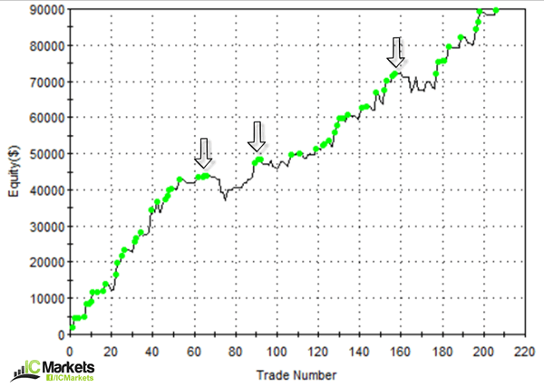
Over the course of 220 trades, the account grew massively. Now, this could have been over a year, five years or even the span of a trader's career. This does not matter. What does matter though is understanding that each individual trade should, as long as you keep to your trading rules and money management strategy, have little effect on the collective outcome. Do we panic if we have a loss, do we panic if we have two, or even three consecutive losses? Absolutely not. Remember, there is no way of knowing the outcome of each trade you take! Do you think the trader who managed the account pictured above panicked when the equity curve started to turn south (see black arrows)? Highly unlikely given the results.
In our humble opinion, trading a method that has a clear edge and following it religiously, while thinking in probabilities, is key to a successful trading career. This type of thinking will not happen overnight. It takes time to develop, but we're sure you'll agree with us that it is certainly worth pursuing!
How to Identify Trendlines
Unlike support and resistance levels, trendlines are drawn at an angle. These widely used technical lines are, first and foremost, used to determine the trend. By drawing these lines one can establish whether a market is in the process of rallying north (an uptrend), dropping south (a downtrend) or in the phase of a consolidation.
However, not all technicians draw these lines in the same manner. Like all things trading, we prefer to keep it simple. At least two swing highs or lows are needed to draw a trendline. The more times a line is respected, nevertheless, the more valid it becomes.
Ascending trendlines
An ascending trendline has a rising angle. As long as price remains above the trendline, the uptrend is considered intact.
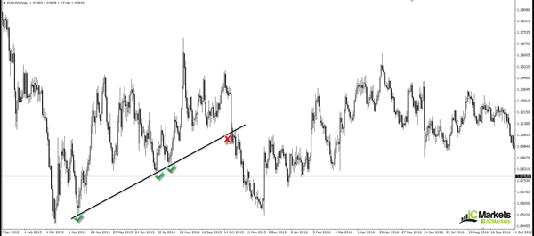
To draw an ascending trendline on a chart, at least two/three subsequent higher lows are required. To begin with we would recommend looking for an extreme low. An extreme low is where price has aggressively rallied and took out several highs along the way. This would be considered a good starting point. Check out the chart below. Using April's low (2015) as an anchor point (the extreme low), and the mid-July low (2015) to form our line, we can see that price respected the trendline in August (2015). It was only once the EUR closed below this barrier in October 2015 did the market suggest that the bears may be gaining the upper hand.
Descending trendlines
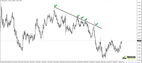
A descending trendline has a declining angle. Similar to the ascending trendline, we look for two/three subsequent lower highs as well as a reasonably extreme high to begin with. Looking at the chart below, we can see that the descending trendline is drawn from an extreme high point. The pair has respected this line numerous times and was aggressively whipsawed on November 8th 2016, which, if you remember, was the date of the US Presidential election. As of current price, it looks as though the unit will be crossing swords with this line again in the not so distant future.
Do we use the candle wicks/tails or the bodies to draw these lines?
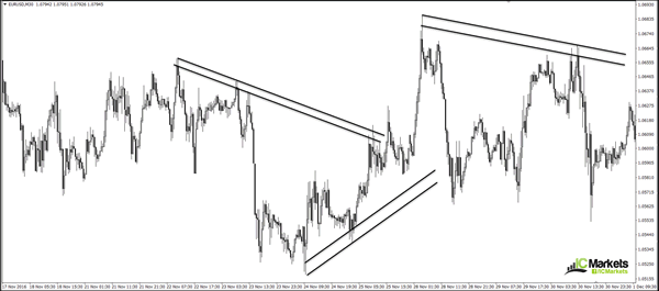
This is a question we see cropping up all the time. And the answer is simple: use both! Adopting both the candle extremes and the bodies allows market participants to pencil in a buffer, so to speak. On the chart below, we have plotted a few buffer zones to demonstrate this in action. In our humble opinion, traders should never consider a trendline to be a definitive line in the market. It should always be considered an area. And by drawing buffer zones, this helps accomplish this.
Once a trendline is broken
When a trendline is consumed, does it have any more use? Yes! Let's say that a trendline support is taken out in the shape of a full-bodied bearish candle. If/when the market revisits this line, the base often provides resistance. You'll be surprised how effective this technique is. In fact, remember the very first chart we looked at in the beginning of this article? This is a perfect example of this. The close below the trendline support was strong. Rather than continuing to plummet south, a few days following the break, price retested the underside of this base as resistance and then proceeded to clock fresh lows.
Additional points to consider
- The slope of a trendline determines the strength of the trend at hand.
- Check correlating markets to confirm the break of a trendline. For example, say that you witness price breach a H1 trendline resistance on the EUR/USD pair, and considering that the USD/CHF is a negatively correlated market to the EUR, we would expect to see a break of support on this pair, be it a trendline support, a demand zone or a support level.
- Is there a best timeframe to trade these lines on? The short answer is no. However, some technicians favour higher-timeframe structure over the lower timeframes as they feel it's more reliable.
- While we do like trendlines, trading solely on the basis of this approach is not recommended. When these lines merge with other technical tools such as, support and resistance, psychological numbers and supply and demand, the probability of a reaction being seen increases dramatically. Remember, the more reasons there are to buy or sell, the more likely it'll happen, hence why we absolutely love trading points of confluence!
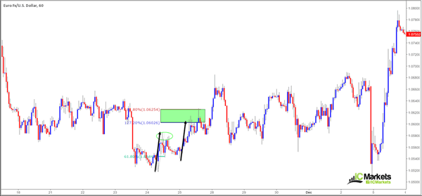
What is an AB=CD Pattern?
Developed by Scott Carney and Larry Pesavento, after being originally discovered by H. M. Gartley, the AB=CD pattern has become an effective technique to have in one's toolbox. After months of research, back testing and also live trading, we feel comfortable presenting this setup to our readers. Just to be clear, the following is not the holy grail. We've simply took what Carney and Pesavento taught and traded it in our own way, and so far, it's worked nicely.
To avoid over complicating things, let's take it from the top...
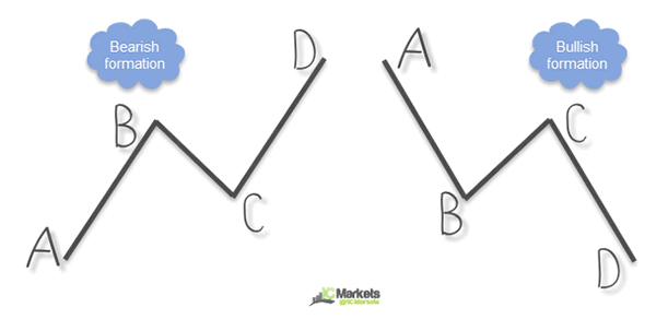
Our way of identifying this formation starts with labelling the four legs: A, B, C, D. The AB=CD pattern means that the CD leg should be at least equal to the length of the AB leg. As can be seen from the diagram above, this is the framework. A rising AB=CD pattern is considered bearish, whereas a descending AB=CD pattern is bullish.
Some traders choose to count how many candles it takes to form the AB leg and then look for a corresponding quantity to be created on the CD leg. Not that there's anything wrong with this, we just choose not to follow this approach.
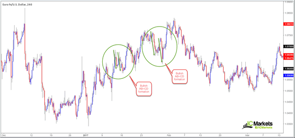
Below are two bullish AB=CD configurations on the EUR/USD H4 chart that worked out beautifully:
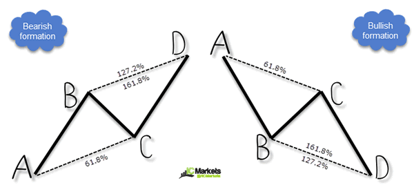
Mr. Fibonacci!
We know of some traders who simply trade the above formation and do very nicely. They are not concerned with Fibonacci drawings. Nevertheless, we find these calculations helpful...
In essence, we look for the BC leg to record a 61.8% Fibonacci retracement. To do this, draw the Fib tool from the A point up to where B completes. Price cannot register a close beyond the 61.8% level - ideally price is to respect this level, give or take a few pips. Carney, on the other hand, states that 'the C point must retrace to either a 0.618 or 0.786'.
The reversal zone (the D-leg completion), is where we look for either a 127.2% or 161.8% Fibonacci extension to converge. Carney called this the 'alternate AB=CD' pattern.
Quite a mouthful, we know! Hopefully the diagram below will help clarify this...
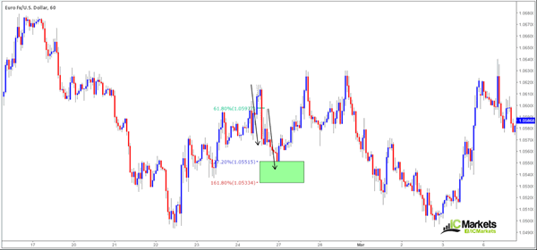
Here's a live chart showing both a bullish and bearish setup with the Fibonacci drawings attached:
Long setup:
As can be seen from the chart, the pattern held firm at the top edge of the 161.8/127.2% reversal zone and rallied a respectable distance!
Short setup:
This sell trade, while the area was respected, was unable to surpass minor structure formed from the high circled in green.
Why we choose to adopt the noted Fibonacci calculations is simple. As the two live examples show, using both the 127.2/161.8% Fibonacci extensions help define a reversal zone (see the green areas). The reason for strictly adopting the 61.8% Fibonacci retracement value at the BC-leg completion is due to this giving better results in our back test, nothing more than this. We found that if price drove too far beyond the 61.8% value, the setup was not as successful.
Further considerations:
- We have found the pattern works far better when the (D) completion point fuses with some kind of structure to the left. What we mean by structure is supply and demand, support and resistance, psychological levels etc.
- In our view, trading the AB=CD as a trend continuation pattern is the better route to take. Although they also work countertrend, trading with the trend tends to be more reliable.
- What timeframe is best? The pattern can be seen on the M1 right up to the monthly timeframe. It is said that the higher timeframes are more consistent, but we've had success using this pattern on the M15, M30 and H1 charts. We've yet to test the validity of the M1 and M5 so it's difficult to judge.
In closing...
Take your time learning this setup. A lot of professional traders use this pattern either as a setup in and of itself or as a way of further confirming another setup.
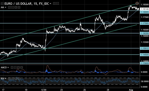
Weak Dollar Supports EUR/USD
The EUR/USD is consolidating after strong growth and currently the quotes are above the important level of 1.1800. Some pressure on the common currency came from the release of the flash manufacturing PMI for the Eurozone that declined by 0.2 to 56.6 in July against the expected 56.8. Traders took the report on GDP in stride as it showed growth by 0.6% which met forecasts. The US dollar is still under pressure thanks to political tensions and growing disappointment in the Trump administrations ability to implement stimulus measures in the US. Further pressure for the USD came from today's report on personal incomes in the US which showed zero growth against a forecasted increase of 0.4%.
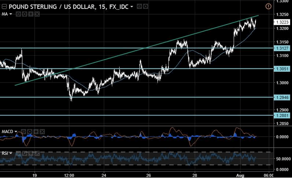
The pound received support from news on the better than expected manufacturing PMI which came in at 55.1 for July against the 54.4 predicted. The weakness of the greenback is the major factor for the growth of the sterling but investors still fear the outcome of negotiations on the terms of Brexit.
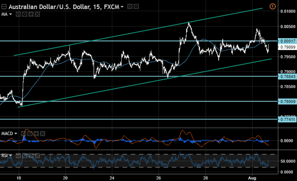
The Australian dollar fell today after the Reserve Bank of Australia commented on worsening trading conditions and the negative impact of a stronger national currency on the pace of economic expansion in the country. On the other hand, commodity markets showed price increases for oil, iron ore, copper, gold etc. which will cheer the bulls to push the price of the aussie higher. Among the medium term risks noted by the RBA includes the high debt level in China who is a major buyer of Australian export goods.
EUR/USD
The single currency has shown consolidation within the rising trend and after its end we may see growth resume with potential target at 1.2000. Stimulus for such a move may come from the news of the fall in construction spending in the US by 1.3% in June. The closest support in case of a descending correction will be at 1.1700 and its breaking may become a signal for the trend reversal.
GBP/USD
The British pound is moving along the inclined resistance line and the closest objective is located at 1.3250. The signal for the bears to pull the quotes down will be breaking through the local support at 1.3200. In this case, the immediate goals will be at 1.3125 and 1.3050. Volatility is likely to increase after the recent decline in the amplitude of price fluctuations.
AUD/USD
The aussie price declined today, but was unable to break the lower limit of the rising channel. After the RSI on the 15-minute chart touches the oversold zone, we may see the price rebound with potential of growth up to 0.8000-0.8050 range. Switching the trend to negative will be possible after the breaking of support at 0.7890. And the target levels within the drop may be at 0.7800 and 0.7740.
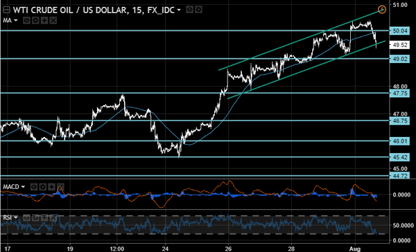
WTI
The price of the light sweet crude oil benchmark demonstrated a confident decline after OPEC published a report according to which the production levels in the cartel increased to 33 million barrels per day. We should note that the statement about export cuts in Saudi Arabia in August and weaker drilling activity in the US has led to a strong rally during recent weeks. In case of breaking the support at 49.00, we may see the price continue to fall to 47.75 and 46.00.
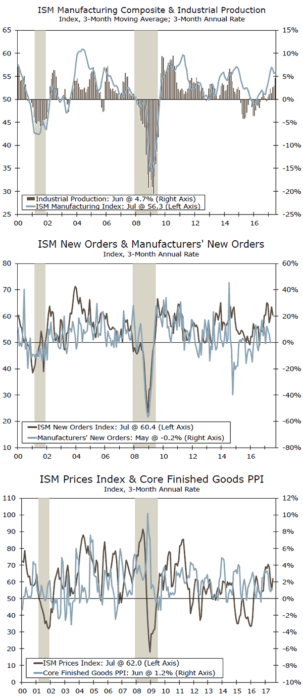
ISM: Manufacturing Sector Continues to Move Forward
Purchasing managers signaled continued gains in the manufacturing sector. Production, new orders and employment registered expansion. Meanwhile, input cost pressures appear to have increased.
Manufacturing Signals for Continued Strength
The ISM manufacturing index moderated to 56.3 in July from 57.8 in June and thereby remains in expansion mode (top chart). This is a positive sign for industrial production and was the eleventh consecutive month in which the index has been above breakeven. Our outlook is for about 2.5 percent growth for industrial production in the second half of this year.
The production subcomponent dropped to 60.6 from 62.4 in June. Fourteen industries reported growth (including wood products, chemicals and machinery) in production, while only textile mills indicated that production declined last month. For both production and employment, the gains were broad-based.
Employment fell to 55.2 in July from 57.2 in June. Eleven of 18 sectors reported gains in employment including paper, food & beverage, plastics and chemicals.
New Orders—Signal of Growth Ahead
Forward-looking indicators also were strong, suggesting that manufacturing production should continue to expand in coming months. New orders remained at a high level at 60.4 and have been in growth mode for 11 straight months (middle chart). Fourteen of 18 industries showed growth in orders, including plastics, electrical equipment, appliances and chemicals. The gains in new orders are solid and very broad-based.
Foreign sources of demand contributed to the overall strength in orders as the new export orders subcomponent came in at 57.5 in July after an index of 59.5 in June. Eleven industries reported growth in new export orders. The "backlog of orders" subcomponent came in at 55.0 in July, the seventh straight month of expansion. Rising backlogs are another forward indication that manufacturing production will continue ahead.
Cost Pressures Appear to Have Increased
Rising commodity prices earlier this year had led to some cost pressures in the nation's factory sector. This is confirmed by the increase of 7 points to 62 for July's prices paid index (bottom chart). Fourteen of the 18 industries surveyed indicated paying increased prices for their inputs. Paper, furniture, primary metals and food & beverage were among the industries paying higher prices.
Commodities up in price included aluminum (for the ninth straight month), corrugated boxes (five straight months) and electric components. The rise in the ISM prices index does intimate upward pressure on core finished goods in the PPI index. Our outlook is for rising inflation that will prompt the FOMC to start to shrink its balance sheet in the fall and raise the federal funds rate as early as December.
Eurozone Mid-Year Economic Outlook
Executive Summary
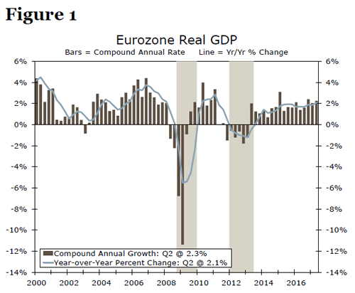
Real GDP accelerated in the Eurozone in Q2, as the year-ago pace of economic growth crossed the 2 percent threshold for the first time since Q1-2011. Economic growth has become increasingly broad based in recent quarters amid steady employment gains and improving business sentiment. Looking forward, we expect that the increasingly self-sustaining economic expansion will remain intact. Our current forecast looks for real GDP in the Eurozone to grow 2.1 percent in 2017 which, if realized, would be the strongest annual average growth rate since 2007.
Like several other advanced nations, Eurozone monetary policymakers face a challenging conundrum; the unemployment rate has reached an eight-year low, but core inflation has been listless around 1 percent for the past two years. As such, policymakers at the European Central Bank (ECB) will likely proceed with caution in coming months as they seek to move away from the highly unconventional monetary policy they adopted in recent years while still keeping the economic momentum going. We look for the ECB to maintain its policy rates for the time being and announce a reduction in its monthly bond purchases at the September 7 meeting, although we acknowledge that policymakers could conceivably wait until the October 26 meeting to make the announcement.
Sustainable Expansion Underway in the Eurozone
Data released today showed that real GDP in the Eurozone grew 0.6 percent (2.3 percent annualized) on a sequential basis in Q2-2017 (Figure 1). On a year-over-year basis, real GDP grew 2.1 percent. The outturn marks the 17th consecutive quarter in which real GDP has risen on a sequential basis. Real GDP in the overall euro area is up 7.0 percent since the mild 2011-13 recession ended, and it currently stands 3.7 percent above it previous peak set in Q1-2008.
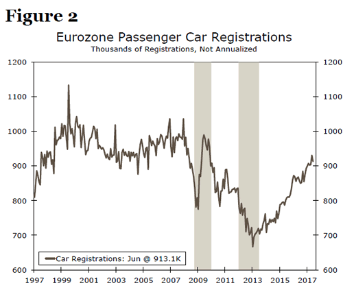
A detailed breakdown of the Q2 GDP data into its underlying demand components is not yet available, but growth in recent quarters has been broad based, which makes the ongoing economic expansion more sustainable. For example, the 1.9 percent year-over-year GDP growth rate that was registered in the first quarter was supported by a 1.6 percent rise in real personal consumption expenditures and by a 3.5 percent increase in real investment spending. Looking at available monthly data from the second quarter, real retail sales were up 0.7 percent (not annualized) in the first two months of Q2-2017 relative to Q1. This growth in real retail spending in conjunction with the uptrend in car registrations (Figure 2) indicates that growth in real personal consumption expenditures remained solid in Q2-2017. Production of capital goods in the first two months of Q2 rose 1.0 percent relative to Q1, suggesting that investment spending likely was solid as well.
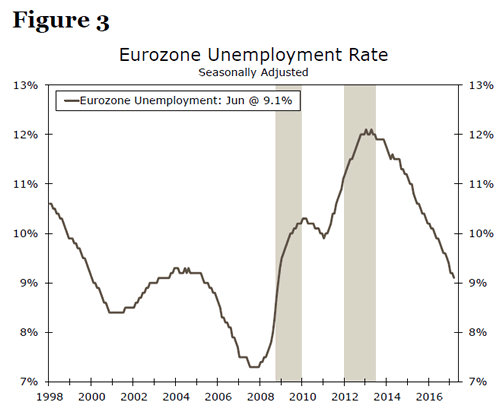
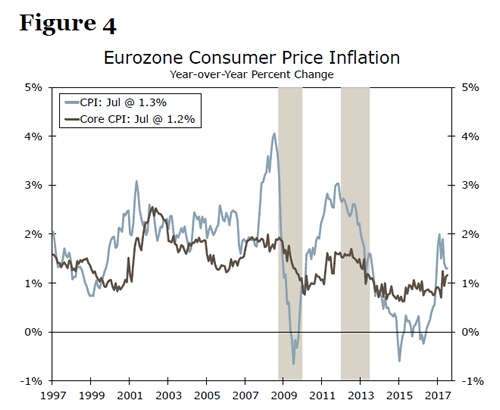
The economic expansion that has been underway in the euro area since 2013 has led to firmer conditions in the labor market. In early 2013, the unemployment rate in the Eurozone exceeded 12 percent (Figure 3). Today, the rate stands at an eight-year low of 9.1 percent. However, despite the solid rate of real GDP growth and the tightening in labor market conditions, inflation remains benign. Although the overall rate of CPI inflation has risen this year, the core rate of inflation, which excludes food and energy prices and which is more reflective of underlying inflationary pressures than the overall rate, has been more or less trendless around 1 percent for the past two years (Figure 4).
As summarized above, real GDP growth has been broadly balanced across spending categories recently, and it appears that the expansion is becoming increasingly self-sustaining. Looking forward, we expect that the economic expansion will remain intact. Strong growth in employment, which is up 1.5 percent on a year-ago basis, should translate into solid growth in consumer spending, and high levels of business confidence in conjunction with accommodative financial conditions should bolster investment spending. Continued economic growth in the rest of the world should help to support export growth in the euro area. Our current forecast looks for real GDP in the Eurozone to grow 2.1 percent in 2017 which, if realized, would be the strongest annual average growth rate since 2007. We look for 2 percent real GDP growth in 2018.
Policy "Normalization" to Get Underway at the ECB
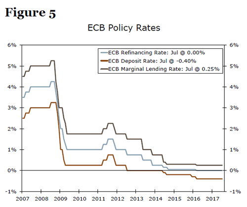
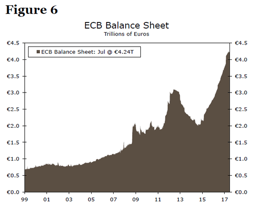
The European Central Bank (ECB) has the single mandate of "price stability," which it interprets as an overall CPI inflation rate of "below, but close to, 2 percent." In that regard, CPI inflation has been below target for more than four years. Consequently, the ECB Governing Council has turned to "unconventional" monetary policy measures in an attempt to boost inflation back towards its target. Not only has the ECB cut its deposit rate into negative territory (Figure 5), but it has also been engaging in a quantitative easing (QE) program over the past two years.1 Between March 2015 and March 2016, the ECB bought €60 billion worth of government bonds per month, but it ramped up its monthly purchase rate to €80 billion in April 2016. It subsequently dialed back its monthly purchases to €60 billion in April 2017. The ECB QE program has swelled the size of its balance sheet from about €2 trillion in early 2015 to more than €4 trillion today (Figure 6).
ECB policymakers envision that the €60 billion/month pace will last "until the end of December 2017, or beyond, if necessary, and in any case until the Governing Council sees a sustained adjustment in the path of inflation consistent with its inflation aim." Given the improvement in economic fundamentals, which should eventually lead to higher inflation, we look for the ECB to announce another reduction in its monthly bond purchases. In our view, this announcement will be made at the September 7 policy meeting, although we acknowledge that the Governing Council could conceivably wait until the October 26 meeting to make the announcement. We believe that the next stepdown in the monthly pace of purchases will take effect in December, and we look for the ECB to cease buying bonds altogether by the end of Q2-2018, at the latest.
The Federal Reserve ended its QE program (October 2014) before it hiked rates (December 2015). Likewise, we believe that the ECB will not hike rates until it has completely wound down its QE program. And just like the Fed, we anticipate that the ECB will wait a number of months until hiking policy rates. In our view, it is likely that the Governing Council will first hike its deposit rate while leaving its two-week refinancing rate and the rate on its marginal lending facility unchanged (see Figure 5). Hiking the deposit rate, which currently stands at -0.40 percent and which sets the lower bound for the overnight interbank rate, will push short-term interbank rates up from negative territory back toward zero percent. Taking the deposit rate into negative territory was an "extraordinary" policy measure, and it seems that the Governing Council would want to first phase out its "extraordinary" measures as it begins the process of "normalizing" monetary policy.
Assuming there are no disruptions in financial markets from the initial hike in the deposit rate, we think the Governing Council will, after a few months, then hike its two-week refinancing rate and the rate on its marginal lending facility. We currently look for the initial hike in the deposit rate in late summer/early fall 2018, with subsequent increases in the refinancing and marginal lending facility rates in Q4-2018. That said, the timing of these rate hikes is highly uncertain and obviously depends on the incoming data flow in coming months. Stay tuned.
Conclusion
Real GDP in the Eurozone rose 0.6 percent in Q2-2017, the 17th consecutive quarter in which economic output in the euro area has grown. The demand-side drivers of real GDP growth appear to be broad based at present, and the economic expansion is becoming increasingly self-sustaining. Although the unemployment rate has receded to an 8-year low, there are few signs yet of a sustained upturn in CPI inflation in the euro area. As a result, we expect the ECB will proceed with caution when shifting from an easing to a tightening policy framework, just like its Federal Reserve counterpart did a few years ago. We look for the ECB to leave its policy rates unchanged for the time being and announce a reduction in its monthly bond purchases at the September 7 meeting, although we acknowledge that policymakers could conceivably wait until the October 26 meeting to make the announcement.
US: Three Hurdles to 3 Percent Growth
Executive Summary
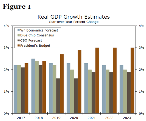
President Trump's official 2018 budget assumes uninterrupted increases in the pace of economic growth during each of the next three years before real GDP growth levels out at 3 percent for every year thereafter. Our own forecast is less sanguine, as are those of the Congressional Budget Office and the Blue Chip consensus (Figure 1). In an interview earlier this year, the president stated, "We're saying 3 (percent) but I say 4 over the next few years. And I say there's no reason we shouldn't be able to get at some point into the future to 5 and above."
The economy's long-run sustainable rate of economic growth is driven by three factors: labor, capital and total factor productivity (TFP). Given current demographic headwinds (boomers are leaving, not entering, today's workforce), and a historically weak stretch for productivity growth, growth of 3 percent is a tall order. In her testimony before Congress earlier this month, Fed Chair Yellen said that 3 percent growth would be "something that would be wonderful if you could accomplish it," but conceded that in reality it "would be quite challenging."3 In our view, 4 percent plus would be nearly impossible. In this special report, we unpack the key drivers used in longrange forecasts and consider the scenarios under which 3 percent growth might be achieved.
In order to achieve sustained 3 percent GDP growth, the economy would need the unlikely occurrence of surging labor force growth like we saw in 1970s/1980s or the capital spending spree/technological innovations seen with the advent of the internet in the 1990s.
Why So Slow? Isn't 3 Percent Just Average?
While it is true that real GDP growth has averaged 3.2 percent per year since 1950, that average is skewed by much higher growth rates in the early part of that period. For more than a generation, 3.0 percent real GDP growth has been much tougher to achieve on a sustained basis. Since 1970, average annual GDP growth has been 2.7 percent. Since 2000, it is just 1.9 percent.
Over the short-run, aggregate spending drives economic growth. It is from the demand-side that economists derived the well-known equation C+I+G+NX=GDP. Although economists measure the economy in this way, over the long run growth is driven by an economy's capacity to produce goods and services. This is a somewhat tricky concept that is best illustrated by an extreme example. If tomorrow all U.S. consumers went out and drained their savings accounts completely, economic growth would surge. However, this surge would do nothing to raise the economy's productive capabilities, and the increase in economic activity would quickly peter out.
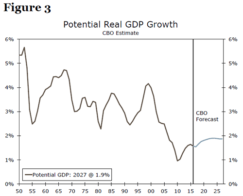
As stated in the intro, it is labor force growth and the growth in the productivity of these workers that determines the sustainable growth rate for the economy. The latter half of this duo can further be divided into two drivers: capital (the physical tools utilized by the workers) and total factor productivity (the intangibles that affect output per hour worked, such as education or new innovations). Potential GDP has decelerated as both labor productivity and labor growth have slowed (Figure 3). Those brief periods when the economy was able to crank along at an above average pace were often made possible by one-off surges in one of the inputs (Figure 4).
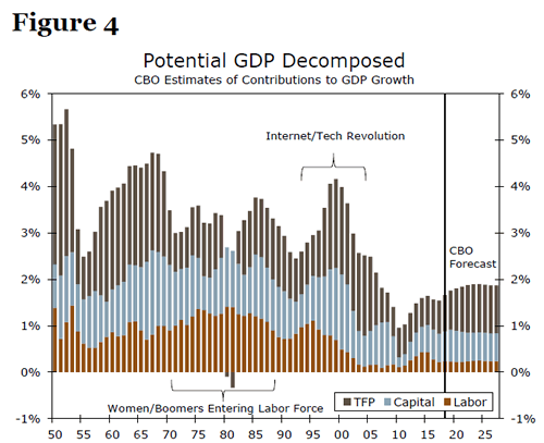
The red bars in Figure 4 illustrate the surge in the labor force that began in the 1970s as baby boomers and women entered the workforce in greater numbers. The blue and brown bars represent the growth of capital and TFP and show the surge that occurred in the second half of the 1990s as American businesses ramped up info-tech spending and embraced new technologies.
At present, there are no clear signals that these dynamics are likely to be repeated in the near term. In the rest of this report, we explore each of these dynamics in greater detail to determine what it would take to reach a sustainable growth rate of 3 percent.
Battling Demographic Headwinds
To achieve sustained economic growth of 3 percent solely through labor input, potential hours worked would need to expand at about 2.2 percent per year, holding the CBO's capital and total factor productivity forecasts constant (Figure 5). This would be a rare feat in U.S. economic history, requiring potential labor hours growth in the neighborhood of the rates achieved during the period when mass inflows into the labor force occurred from baby boomers and women. The year-over-year percent change in the workforce is plotted in Figure 5 and illustrates the challenge in unmistakable terms.
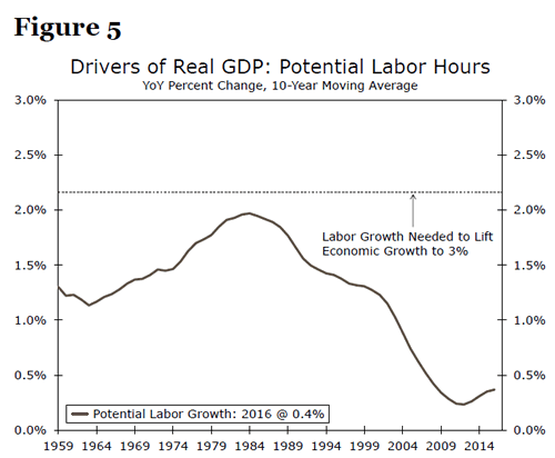
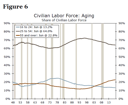
Such a dramatic rebound in the growth rate of the labor force would not only reverse a trenddecline that has been in place for more than a generation, it would also be at odds with underlying demographic trends and the aging of the population. Since 1997, the 55-and-over crowd has increased as a share of the labor force at the expense of younger workers (Figure 6). Notably, in 2003 the share of these older workers in the labor force surpassed that of 16-24 year-olds. Primeage workers (25-54 year-olds) are still the lifeblood of the labor force, but the graying of the American workforce exhibits a clear upward trend.
The fertility rate in the United States in 2016 was the lowest it has ever been. Even if incentives for boosting fertility were adopted today, there is a roughly 20-year lag before those measures bear fruit in terms of faster labor force growth. A liberalization of immigration policy could boost labor force growth more quickly, but this is likely a non-starter in the current political climate.
Labor Productivity Left to Pick Up the Slack
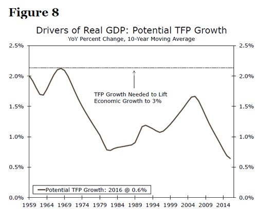
So, if labor force growth cannot be boosted in the near term, what about measures to boost capital and productivity? To achieve sustained potential GDP growth of 3 percent over the next decade through capital alone, potential capital growth would need to average about 5.5 percent, well above even the fastest historical potential growth rates (Figure 7). Similarly, to achieve potential GDP growth of 3 percent over the next decade through TFP growth alone, potential TFP growth would need to average approximately 2.1 percent, more than four times higher than the pace of actual TFP growth over the past year and much higher than has been achieved for most of the recent past (Figure 8).
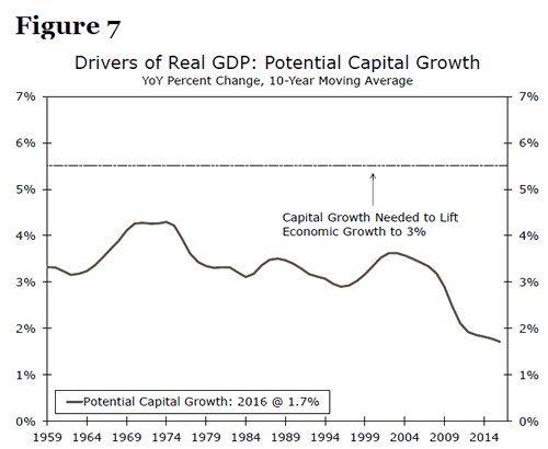
As it happens, capital spending in this cycle has been weak, though it is getting stronger. A slowdown in energy-related spending contributed to a run of four consecutive quarterly declines in real equipment spending last year. Prior to this period, we had never witnessed more than two consecutive quarterly declines outside of a recession. Equipment spending turned positive in the fourth quarter of 2016 and has now increased for three straight quarters. Business sentiment has improved in recent months, and core capital goods orders are firming as well, so we expect a modest improvement in capital spending, but not enough to drive the sort of capital growth we would need to hit 3 percent growth.
Total factor productivity has perhaps the most potential to boost growth, as growth in TFP flows through one-for-one to growth in potential GDP. The challenge with total factor productivity growth is that, among the three components, it is the most elusive. Increasing inputs such as capital and labor, while no easy feat, is at least straightforward. Increasing the efficiency with which those inputs create output, however, is a more daunting task. Developing more skilled workers through education is one potential avenue, but college enrollment rates have flat-lined after decades of rising. Fostering the conditions for entrepreneurship and innovation is another important step, but the steps necessary to do so are neither always clear nor easy. Perhaps the widespread use of artificial intelligence or some other major breakthrough is right around the corner, but the timing and extent of its economic impact would be huge question marks, and banking on this occurring is not much of an economic strategy from a policymaking perspective.
Wait Wait Wait: Can't All These Things Improve at Once?
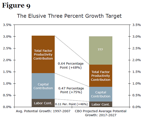
The above examples illustrate the challenge in achieving 3 percent potential growth by improving one input alone. However, at this point some of our more optimistic readers might be asking: what if all three drivers of potential growth increase at once? To illustrate what this might look like, we turn to the last time real potential GDP growth averaged 3 percent over a 10-year period. Figure 9 illustrates the average contributions to potential growth from labor, capital and TFP from 1997-2007, the last time this feat was achieved. This period saw robust total factor productivity and capital growth as businesses and individuals embraced computers and information technology. Over the next decade, potential total factor productivity growth would need to be approximately 68 percent faster than the CBO projects, or roughly 0.6 percentage points, while potential capital growth would need to be about 75 percent faster each year.
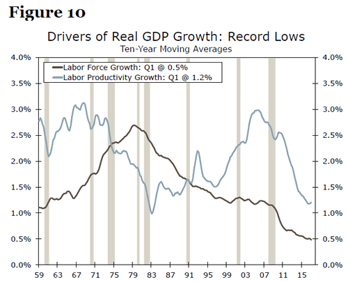
Ultimately, the key challenge is that labor and productivity often change at a glacial pace, and the current trend growth rates are historically slow. An optimist might say perhaps this means there is only room to go up from here. However, due to the long lead times needed for a change in these long-term factors influencing growth, such a low base today implies that even solid progress might not be enough to achieve robust growth of 3-4 percent. Furthermore, to achieve 3 percent growth, everything has to improve simultaneously. This is of course possible, but raising the pace of growth in labor, capital and TFP all at once is a tall task. As illustrated in Figure 10, there is little precedent for surging labor force and labor productivity growth occurring simultaneously over a 10-year period (Figure 10).
Conclusion
The economy's long-run sustainable rate of economic growth is driven by three factors: labor, capital and total factor productivity. Our analysis considers what kind of growth it would take in any one of these factors individually or in combination to achieve 3 percent growth on a sustained basis. While we agree with Chair Yellen's assessment that such a growth environment would be wonderful, it would also be very difficult to achieve and maintain.
In our assessment, the world's largest economy can only grow at 3 percent on a sustained basis if one makes unrealistically rosy assumptions about the pace of labor force growth that would match the simultaneous arrival of women in larger numbers and the baby boomers' entry into the workforce seen in the late 1970s/early 1980s. The 3 percent goal would also likely require a pace of capital spending like we witnessed with the capital spending spree of the 1990s.
None of this is to say that the economy could never grow at such a strong pace again, but past cycles have demonstrated that all three of these factors tend to change at a slow pace, which suggests long lead times before new policies could achieve the fleeting objective of 3 percent growth.
Gold Soars Further as USD Continues to Sink
Gold prices rose further last week, boosted by the unrelenting decline in the dollar. Without any major risk events on the horizon, we think that the yellow metal's price could continue to be dictated by the performance of the greenback over the next days. Given the latest turmoil in the White House and the subdued market expectations for another Fed rate hike this year, we think that the US currency could remain under pressure for a while. Something like that could keep the yellow metal supported.
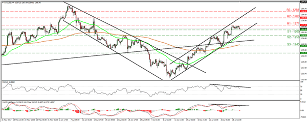
XAU/USD continued edging north last week, but traded in a consolidative manner yesterday between the support of 1265 (S1) and the resistance of 1271 (R1). The price structure on the 4-hour chart remains higher peaks and higher troughs within the upside channel that has been containing the price action since the 10th of July. Hence, we consider the short-term outlook to still be positive. A clear break above 1271 (R1) would confirm a forthcoming higher high and perhaps set the stage for extensions towards our next resistance of 1280 (R2).
Nevertheless, taking a look at our short-term momentum indicators, we stay mindful that a corrective setback may be looming before the next leg north. The RSI turned down after it hit resistance near its 70 line, while the MACD, although positive, has topped and fallen below its trigger line. What's more, there is negative divergence between both these indicators and the price action.
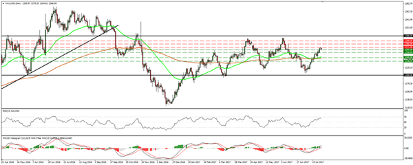
As for the broader outlook, the metal continues to trade in the sideways range that's been in place since the end of January, between the 1200 and 1300 key barriers. The latest short-term uptrend began from near the lower bound of that range. As such, this increases the likelihood for further near-term advances, perhaps for a test near the upper bound of the range, at 1300.