

Sample Category Title
NZDUSD Pares Losses After Hitting 2 ½-Year Lows, 0.6600 Resistance Eyed
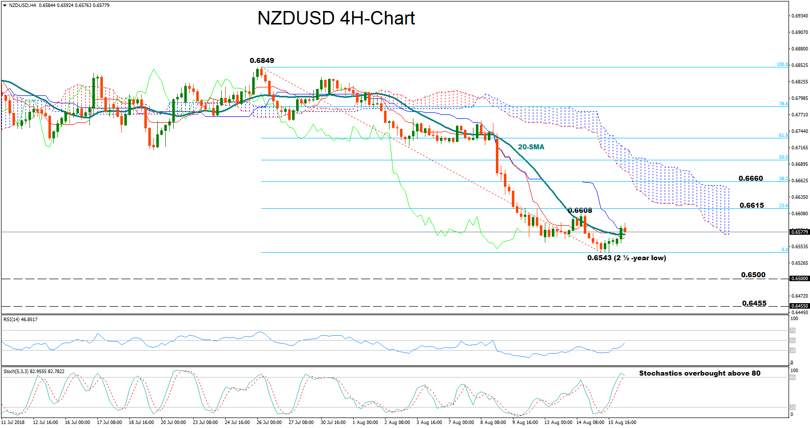
NZDUSD paused its steep downfall at the 2 ½-year low of 0.6543 on Wednesday, reversing higher to recover losses made earlier this week. The RSI in the 4-hour chart stretched to the upside as well and is set to test its neutral 50 mark for the first time in 8 days after dropping below 30 in oversold territory. While this increases the chances for further recovery, the fast stochastics suggest that negative corrections are not unlikely as the green %K line is looking on track to break below the red %D line in overbought territory.
If bearish pressures dominate, the price could touch the bottom created around 0.6543, where a leg lower could look for support around the 0.6500 psychological level, bringing the downtrend from 0.6849 back into play. Steeper declines could also meet support at 0.6455, a previous resistance area in September 2015.
On the other hand, if the market extends its recovery, bulls could stop around Tuesday’s high of 0.6608, which is located marginally below the 23.6% Fibonacci of 0.6615 of the upleg from 0.6849 to 0.6543. Further above, traders could speculate that the steep downfall from 0.6849 has completed and further upside may follow. In this case, the attention would turn to the 38.2% Fibonacci of 0.6660.
EUR/USD Recovers Losses
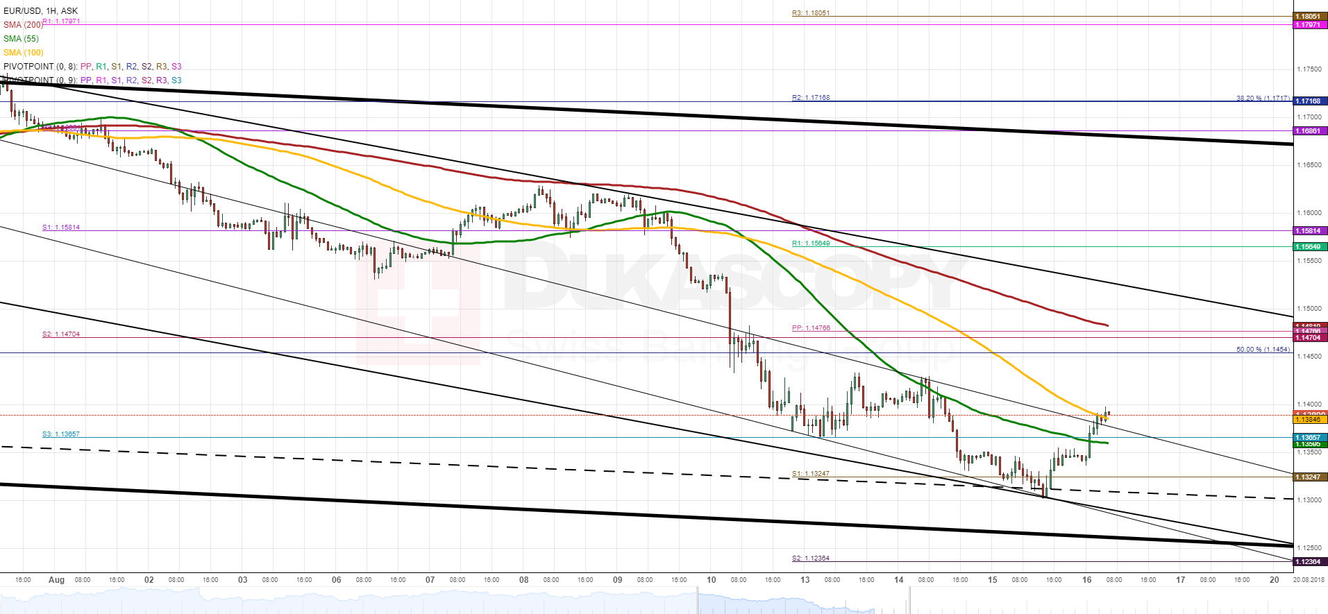
Even though the weekly S1 did not hold the Euro mid-Wednesday, its subsequent fall against the US Dollar was not significant due to the psychological 1.13 level being located nearby.
Bears were not able to breach this 13-month low, thus sending the pair considerably higher during the following hours. It managed to breach the monthly S3 and the 55–hour SMA along the way, thus finally catching up with technical indicators which were showing an upward-sloping tendency already on Tuesday.
Given that the rate breached the 100-hour SMA, it is likely that the current surge continues in this session, as well. The nearest resistance is the relatively distant monthly S2, the weekly PP and the 200-hour SMA at 1.1470.
Meanwhile, a fall is unlikely to go below 1.13.
GBP/USD Remains Steady
The Sterling has remained relatively unchanged against the US Dollar since the beginning of this week. It seems that the pair tried to edge higher during this time, but it was stopped by the 55– and 100-hour SMAs.
At the time of this analysis, the Pound was fluctuating around the 1.27 level slightly below these moving averages. Technical indicators remain bullish; thus, a breakout could finally happen today. The following upward target after this breakout is the breached senior channel and the 200-hour and 200-period (4H) SMAs circa 1.2850.
It is unlikely that the pair extends its losses below the weekly S1 at 1.2650 in this session. Thus, even if the aforementioned breakout to the upside does not occur, the pair is expected to continue consolidating with a slight tendency southwards.

USD/JPY Tests 110.90
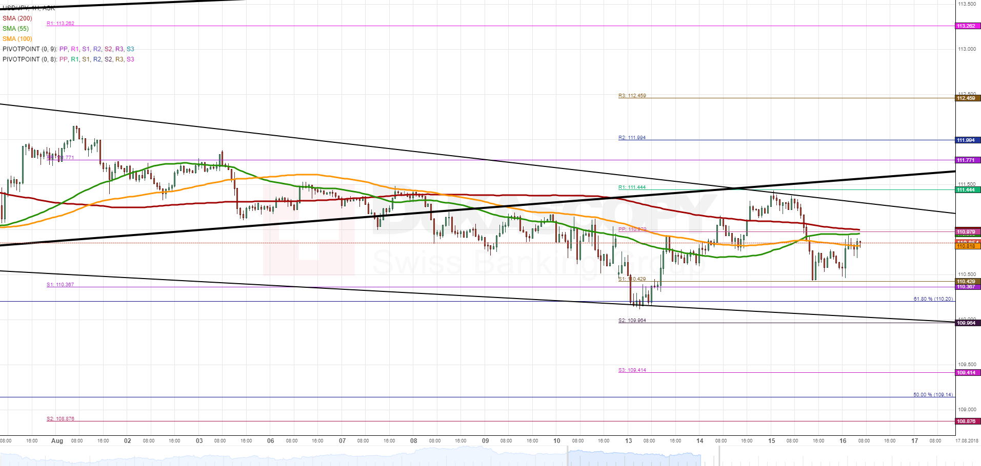
Strong downside risks prevailed early on Wednesday which resulted in USD/JPY falling 93 pips until late in the evening when this bearish sentiment reversed back to the upside. Significant advances did not follow, being halted by the combined resistance of the 55-, 100– and 200-hour SMAs circa 110.90.
It is likely that the rate lacks the necessary upward momentum to dash through this cluster today, as no important fundamental data releases that could add bullish momentum are not scheduled today. In line with this bearish scenario, the US Dollar is should be pushed back down to the bottom boundary of a five-week falling wedge at 110.00.
In the unlikely event that the rate breaches 110.90, another important resistance is the breached channel line and the weekly R1 at 111.50.
XAU/USD Reverses At 1,160.00
Gold continues to decline against the US Dollar for the third consecutive session. The pair breached the senior channel down early on Wednesday, being followed by a 2.38% fall down to 1,165.00.
On Thursday morning, technical indicators were located in the strongly oversold territory. This indicates that bulls may want to recover some of their positions lost during the previous trading sessions.
An important resistance to look out for is the 55-hour SMA at 1,1900.00. The ultimate daily high should be the monthly S1 and the 200-hour SMA circa 1,205.00. Meanwhile, support is set by the monthly S3 at 1,148.00.

Forex Technical Analysis: EUR/USD, USD/JPY, GBP/USD
EUR/USD
Current level - 1.1368
The violation of 1.1360 resistance could be a signal for a larger rebound above 1.1300, towards 1.1510 major hurdle, but only a break of 1.1430 resistance can confirm such an outlook.
| Resistance | Support | ||
| intraday | intraweek | intraday | intraweek |
| 1.1430 | 1.1510 | 1.1300 | 1.1300 |
| 1.1510 | 1.1750 | 1.1210 | 1.1100 |

USD/JPY
Current level - 110.86
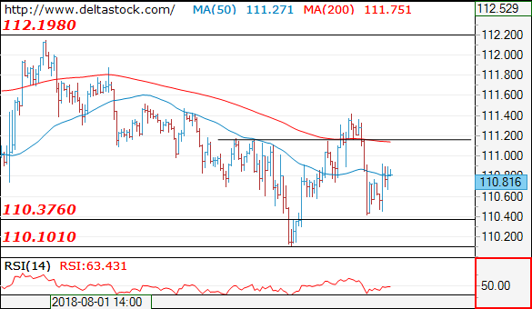
The slide through 110.70 crucial low shows a reversal of the whole rise since 110.10 and the outlook is bearish below 111.20, for s dip to the last week's low.
| Resistance | Support | ||
| intraday | intraweek | intraday | intraweek |
| 111.20 | 114.50 | 110.40 | 110.10 |
| 112.10 | 114.50 | 110.10 | 109.30 |
GBP/USD
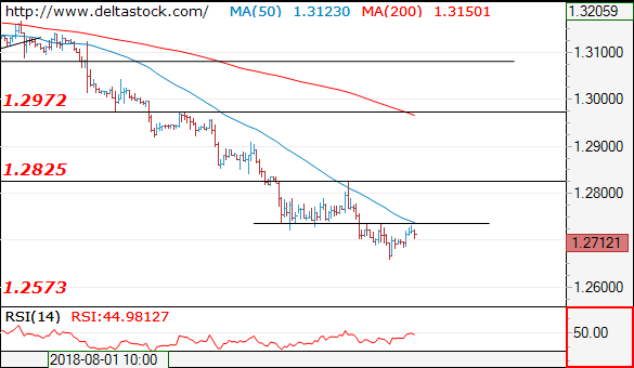
Current level - 1.2712
The bias remains bearish below 1.2740, for a slide towards 1.2570 area. Crucial on the upside is 1.2830.
| Resistance | Support | ||
| intraday | intraweek | intraday | intraweek |
| 1.2740 | 1.2970 | 1.2660 | 1.2570 |
| 1.2830 | 1.3210 | 1.2570 | 1.2570 |
Stocks Rebound As Geopolitical Concerns Ease Off | Dollar And Gold Under Focus
- Germany has also planned to host Erdogan for a state visit
- Trump has made the US position even weaker which presents a much higher geopolitical risk
- The bull run for the dollar index has eased off a little
European markets and US futures are trading higher as investors have cheered the fact that Turkey has many strong allies who can help the country during its current tough time. These allies are committed to provide support, weather and prevent the country from facing any kind of crisis. Angela Merkel, the true leader of the free world and German Chancellor had a discussion with Turkey and assured the country's support.
The primary fact is that Turkey is a major trade partner for Germany and it cannot afford to let the country slip into chaos. Moreover, Germany has also planned to host Erdogan for a state visit on September 28th. Just to put things in perspective, the country had nearly €37 billion of bilateral trade only last year and nearly 6,500 companies which are partly or completely owned by Germany operate in Turkey.
Erdogan's clash with Donald Trump and friendly calls with Qatar and Germany presents a new landscape for Turkey, something which the world is closely paying attention to. Qatar stood up for its rights against Saudi Arabia and assured investors that it is fully capable to grow while facing economic pressure, the country has confirmed $15 billion worth of investment in Turkey.
The only two countries which are left out for the time being are Iran and China. Russia has already shown sympathy towards Turkey and has significant trade relations. Iran and Turkey are major trade partners and by escalating tensions with Turkey. Additionally, Trump has made the US position even weaker which presents a much higher geopolitical risk for investors over the coming future.
Staying with the geopolitical tensions, the trade tariffs spat between the US and China is back in the focus. Chinese commerce minister would travel to the US in late August to discuss the issues on trade.
The bull run for the dollar index has eased off a little but we do not see any convincing move for the gold price which tells us that traders are still very bearish views about the metal. It is likely that the gold price may continue to grind lower and the next important level to watch out for gold is at $1150.
Technical Analysis: Brent And Gold
- Brent Oil: Trading in a downward channel
- Gold: Desending traingle pattern complete, price oversold
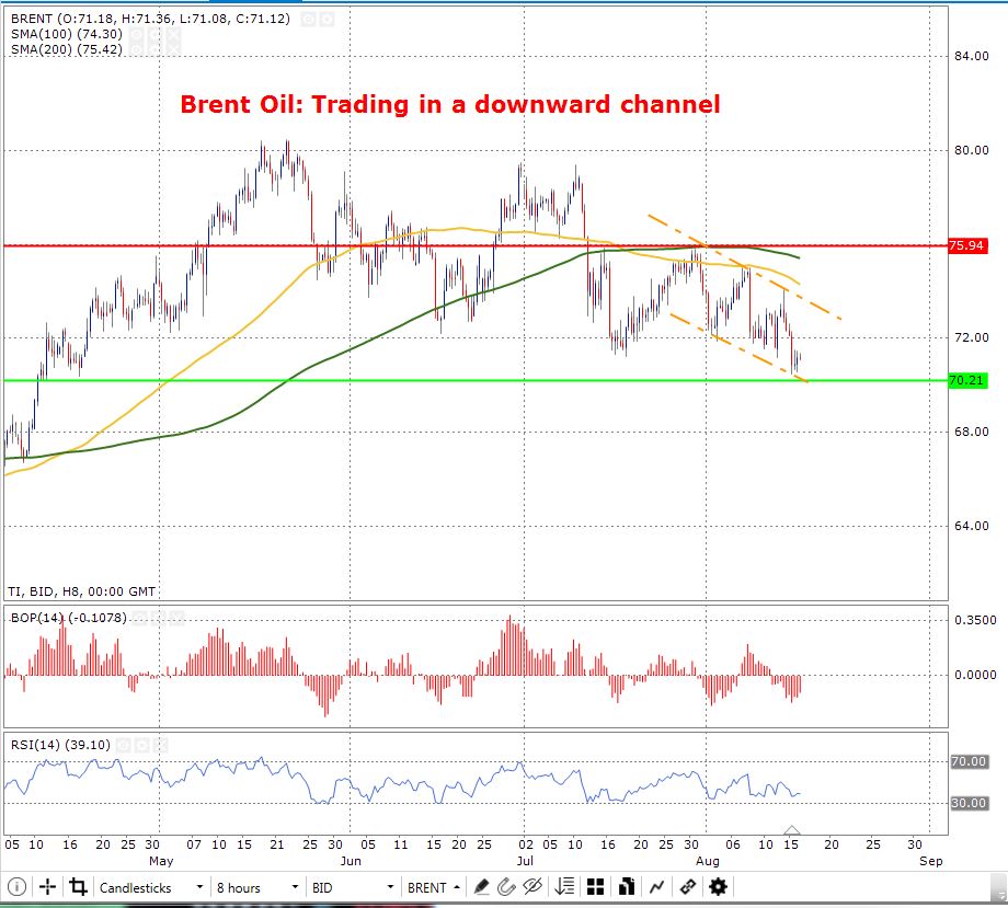
Brent Oil: Trading in a downward channel
The intraday chart (8 hour) for Brent oil shows that oil is trading in a downward channel. This can be seen by the two orange lines which outline the downward channel. Moreover, the price is trading below the 100 and 200-day SMA, this confirms that the downtrend is strongly in play. Having said this, the price is trading close enough to the lower line of the downward channel, this increases the probability of an upward move. The last time the price had dropped to 70.21 (the current support line shown in green colour) dates back to the 11th May and since then it has now once again come close.
When looking at the Relative Strength Index it is apparent that the price is currently in the oversold territory as the price is hovering near enough the 30 mark. This shows that there may be a bullish movement on its way.
Moreover, when looking at the balance of Power it is seeming that, yes there is a bearish trend but not to an extreme. In fact, when looking closely at the Balance of Power indicator it is evident that the bulls may take control as the price seems to be gradually ascending.
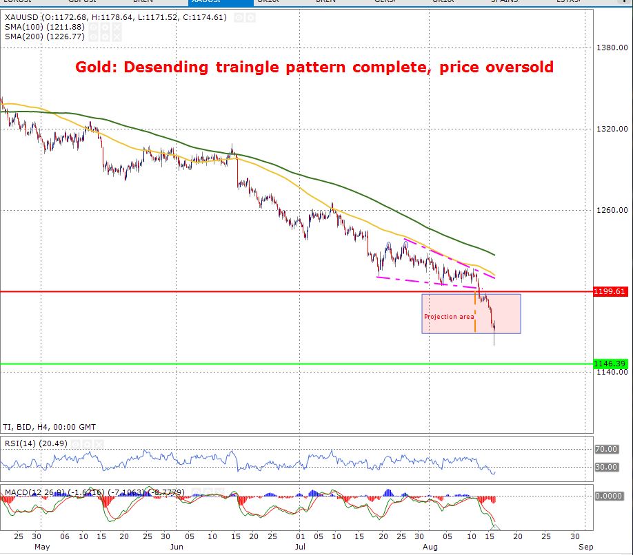
Gold: Desending traingle pattern complete, price oversold
The below chart for gold displays that the price has completed the descending triangle pattern. The decedning triangle started on the 20th July and it broke out of this pattern to the downside on the 09th of August. The descending triangle pattern is clearly visible outlined in pink, this shows that a downward momentum is strong. Moreover, the price is not entirely but still in the motion of approaching the support area which is the green line and is priced at $1,146.39.
The Relative Strength Index informs that the price has been way over sold as it is apparent that it is way below the 30 mark. This shows that a bullish movement maybe among the markets for gold.
Supply and Demand Trading
In the following article, our objective is simple: to try and shed some light on how one can trade supply and demand on a chart. For those who are new to this concept, you may want to consider checking out this article before continuing as it provides a solid foundation: How to Identify Supply and Demand
Before we begin, we’d also like to remind our readers that technical supply and demand, much like every other technical method, will have losses. It does not matter which indicator you use to confirm a zone or what your favourite trading guru says, losses are a part of this business. It’s how you handle these losses that’ll define you as a trader.
Momentum from the zone.
Ideally, when looking for supply and demand zones, you’ll want to choose areas that boast healthy momentum that have managed to take out nearby highs/lows. Why do we look for this? Well, quite simply, we’re looking for points on the chart that show price was able to move with little opposition.
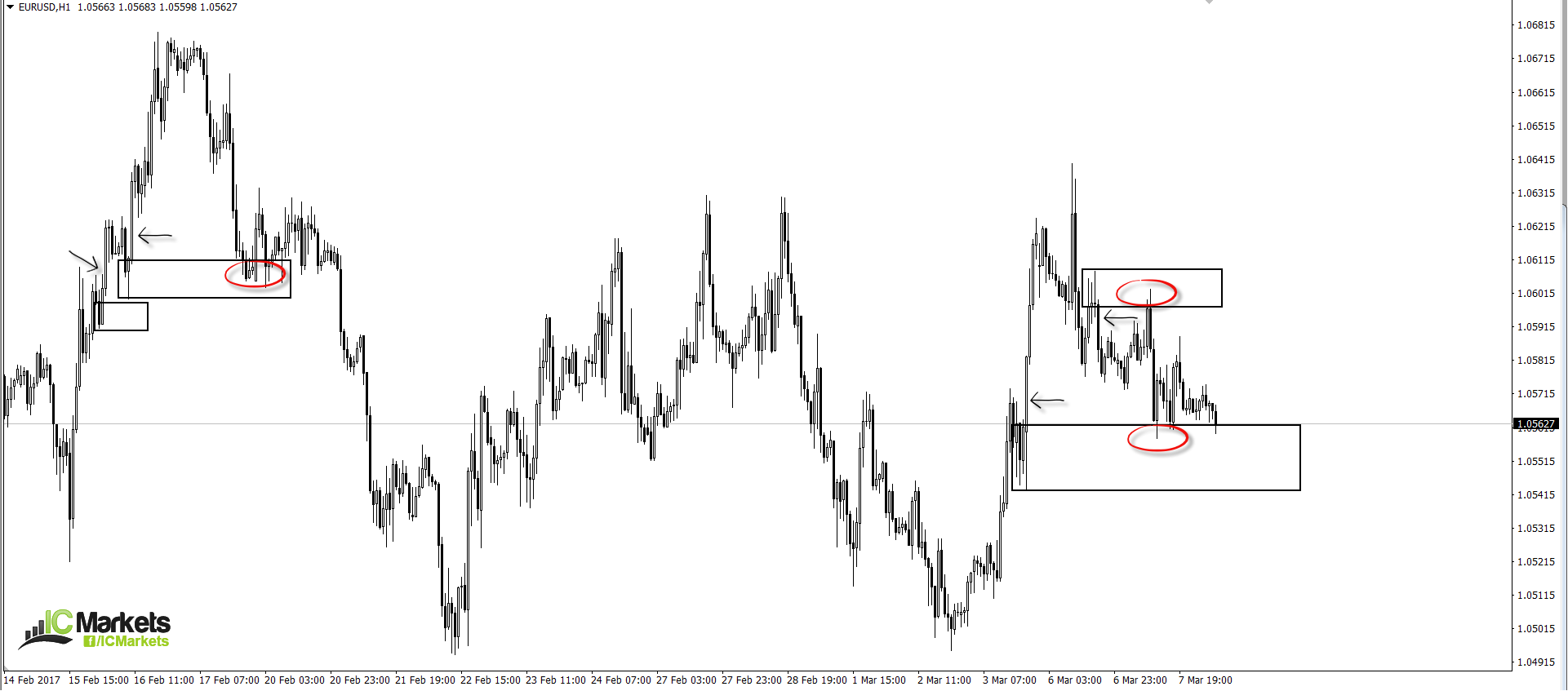
On the chart below, we have marked four areas, each of which are displaying what we would consider to be a strong move (see black arrows).
Duration of time spent away from the zone.
Here is where we may differ from other supply and demand traders. We rarely select areas of supply and demand that show price has spent a long duration of time away from the zone. Of course, we have done this in the past but the results were average at best. So, what’s the difference between a newly formed area to a zone which has not been visited for say, a year?
To answer this question, let’s take a look at the logic behind these barriers. It is said that supply and demand zones work due to institutional traders leaving unfilled orders around the base of these areas. Now, if you were an institutional trader, would you really leave an open order in the market Empirically speaking, however, we have found that areas where price has NOT spent a long duration of time trading from its zone have been the more high-probability areas to trade.
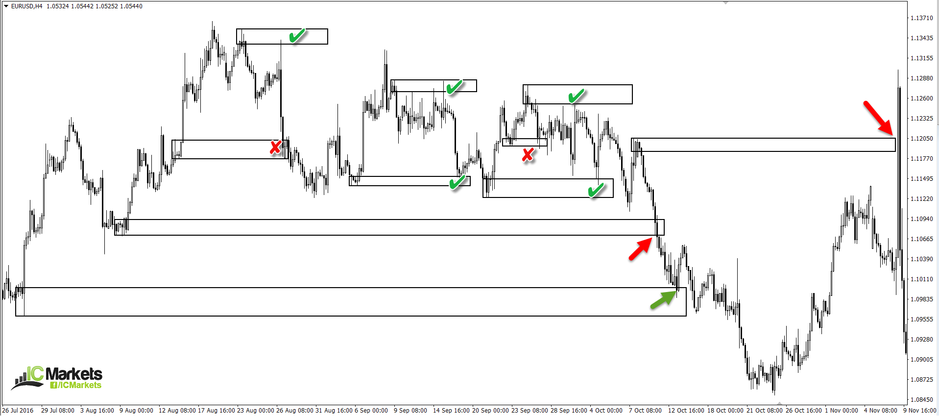
Take a look at the H4 chart below. One will be able to see that areas where price has spent a considerable time away from the zone (see arrows) did not fair too well. Now have a look at the ones which spent, at most, a week trading from the area. Out of seven, two failed.
Fresh!
This is a term we see getting thrown around trading forums a lot! Is the zone fresh? Whilst we believe there is no right and wrong in trading, here is our two cents’ worth on the subject…
For us to label an area as fresh, two conditions need to be met. Firstly, the zone has to form on its own. It cannot be shaped from a reaction to another zone. Secondly, the base needs to fresh/untouched. We realise this may be a bit difficult to picture, so here’s a chart showing, what we’d consider to be, three fresh zones:
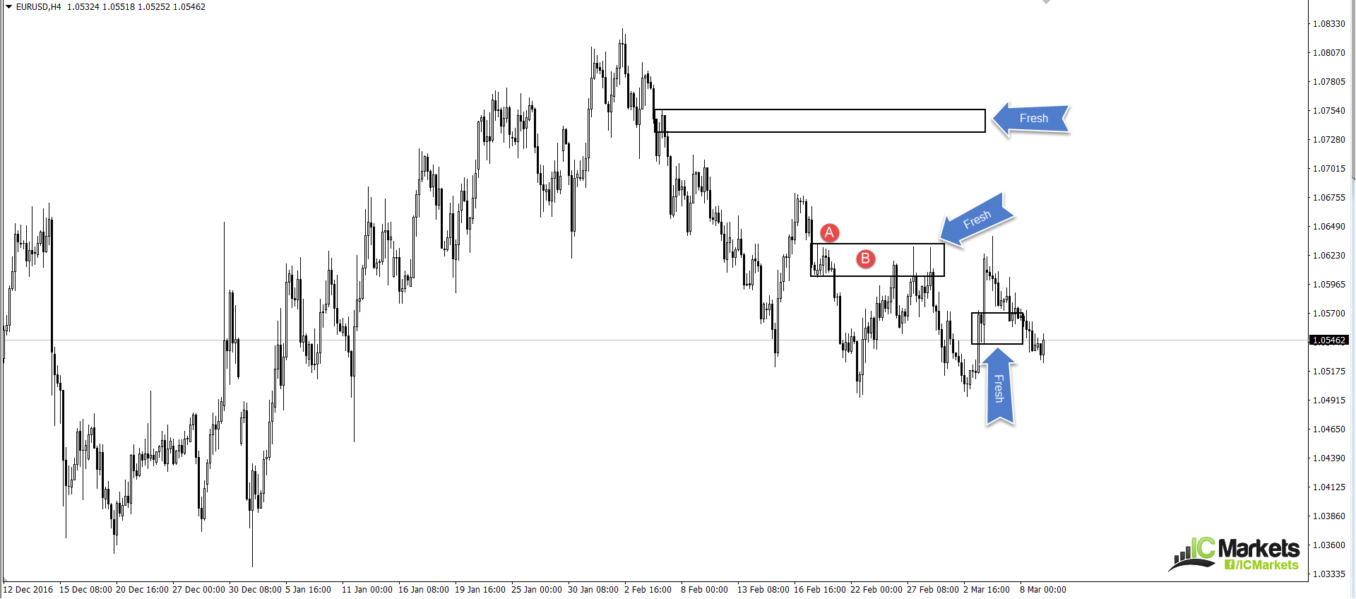
At point A, you’ll notice that the supply area did not form from a reaction to another supply zone above. And at point B, until price retested the base of course, it was fresh and untouched. Trading the first time back to these fresh hurdles has proven to be the most effective.
Trend direction
We’re sure that the majority of those reading this article have heard of the old adage: ‘the trend is you friend’. While we believe that trading with the trend is good, one also has to take into account that the market is fractal. Just because you see an uptrend on the H1, it does not mean that the daily timeframe, or even the H4 timeframe, will also be trending northbound. Therefore, we ideally want to see some confluence here. If the H1, H4 and daily timeframe show a trending market, the chance of a successful trade from a H1 supply or demand area greatly increases.
In addition to the above, it may be worth taking the time to study multi-timeframe analysis. Trading short from a supply zone on say, the a H1 timeframe, may look great according to your trend analysis. But if you fail to take into consideration what the higher-timeframe structure is doing, you may very well find that you’re selling into a daily demand base! And this is not somewhere you want to be placing sell orders, no matter what the trend direction is suggesting.
One needs to always check where they are on the bigger picture. If, for example, there are no higher-timeframe obstacles in your way and the overall trend is favourable, trading at nearby supply and demand zones have a much higher probability of working out.
In closing…
Should you look to implement some of the above said methods into your trading plan, your results will very likely improve!
Here are some other concepts traders may want to use to further confirm a zone of interest:
- Trendline convergence. Should a trendline converge with your chosen supply or demand zone, the odds of a bounce being seen is greatly enhanced.
- The approach. Is price forming an AB=CD Harmonic approach (we’ll cover this pattern in future articles), or a three-drive pattern?
- Is there a psychological handle or a long-term support/resistance level intersecting with your area?
There is a plethora of methods one can use to enhance the probability of a zone holding firm. Each individual is different and will therefore rarely look at the charts the same way. It is your job as a trader to find what works for you.
How to Identify Supply and Demand
Technical supply and demand is an approach based on price action. The general idea is to locate points on the chart where price has made a strong advance or decline. A demand zone is typically formed after a strong rally north. Conversely, a supply zone is effectively created following a noticeable move to the downside. This method, especially in the price action community, is widely popular.
There are four key areas of interest on the charts to look for:
The rally base rally, or ‘RBR’.
The drop base drop, or ‘DBD’.
The drop base rally, or ‘DBR’.
The rally base drop, or ‘RBD’.
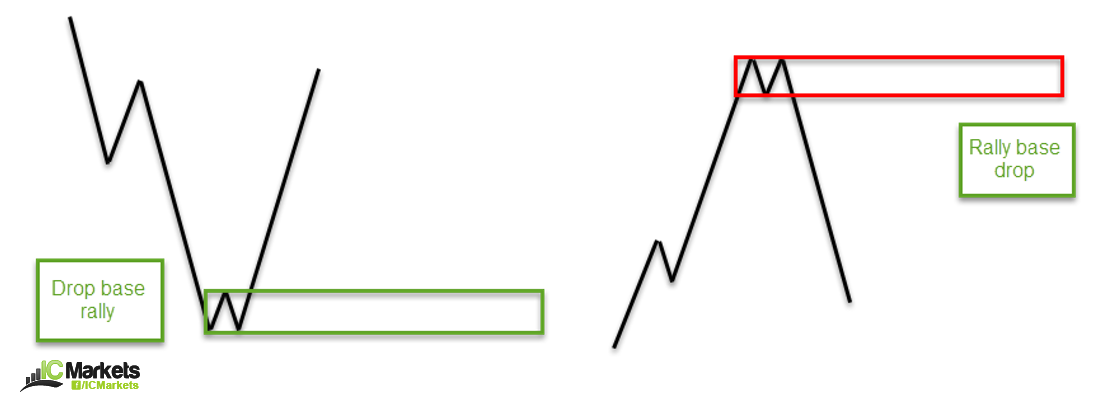
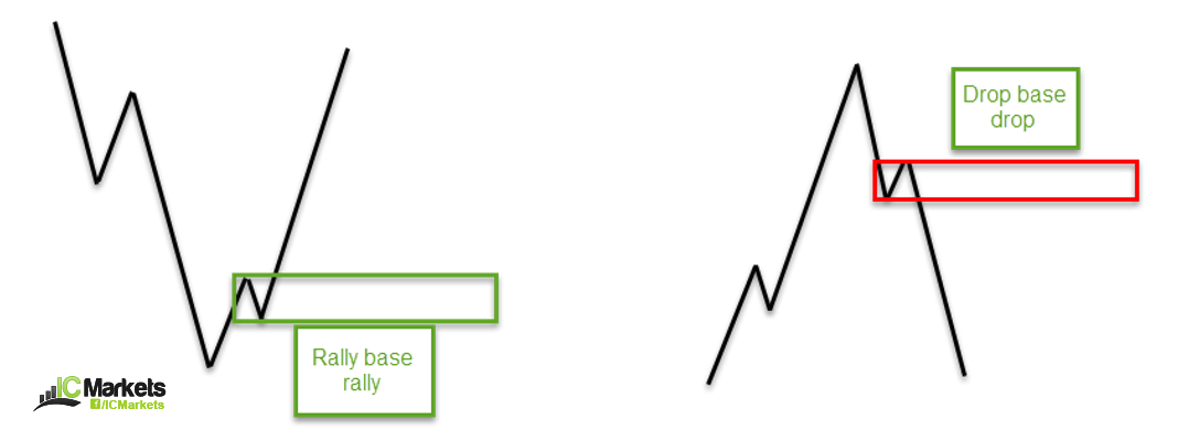
- A ‘RBR’ demand zone primarily forms within an uptrend. From the image above, notice that price begins with an advance, and then moves into a consolidation phase (the base), which is then followed up with a continuation move to the upside. These barriers are effective at bouncing price, especially on the first time back.
- A ‘DBD’ supply zone is essentially the same formation as a ‘RBR’ area, but formed within a down trending environment. Referring to the image above, we can see that price begins with a decline in value, and then enters into a consolidation phase, which eventually follows through with a continuation move to the downside. The area formed is typically a stable zone in which one can look to short (sell) from.
- A ‘DBR’ demand is a zone which normally denotes a market bottom. As we can see from the image above, price was initially trending south until the piece began to bottom out (or base) and then reverse to the upside. The zone is usually an effective area to hunt for longs (buys).
- A ‘RBD’ supply is basically constructed in the same manner as the ‘DBR’ formation. The only difference is that instead of a market bottom, this pattern forms a market top and is used to hunt for selling opportunities.
Now that we have a basic idea of what to look for, here’s what some of the above noted zones look like on a live chart. Obviously, not all areas will give winning trades! Learning how to accept a loss is a large part of trading any methodology.
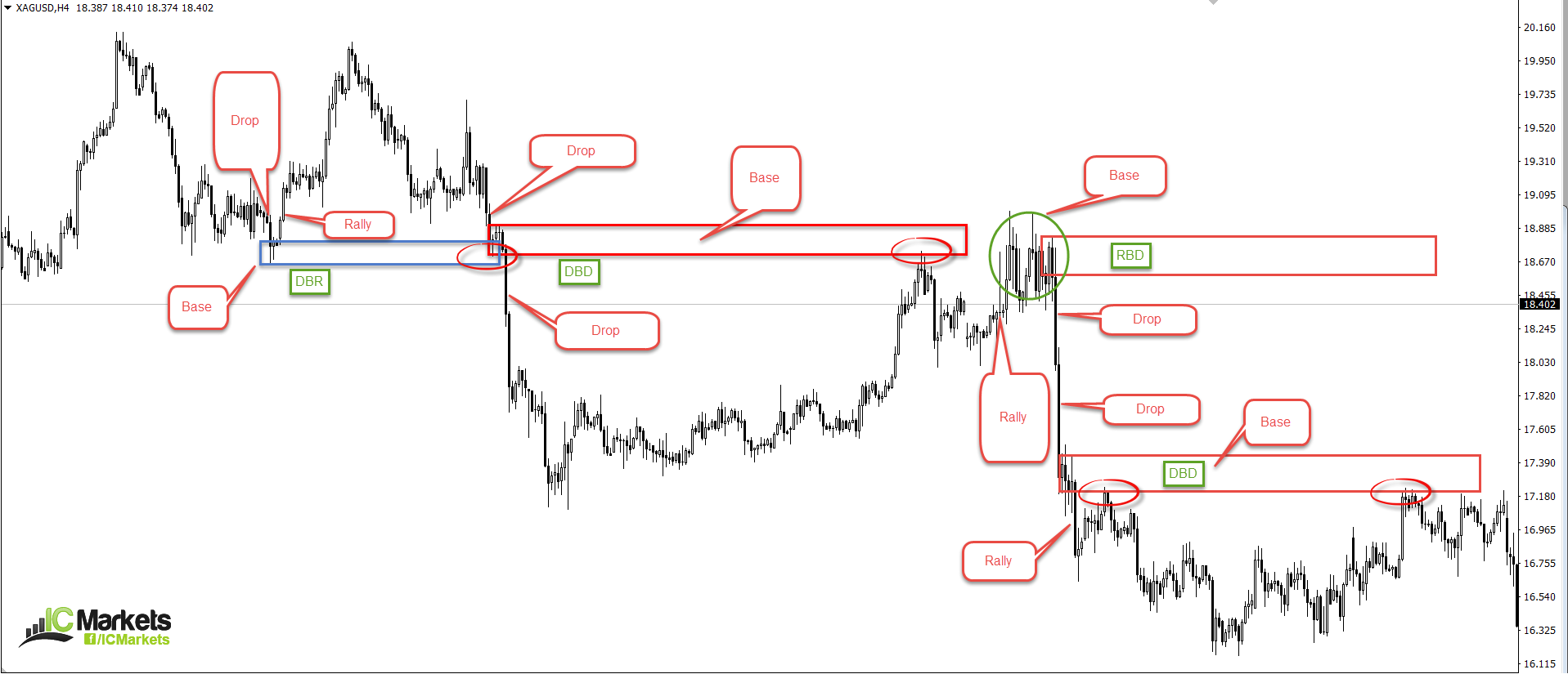
Additional points to consider
- Ideally, look for strong, obvious moves in the market that have taken out prior highs or lows. This demonstrates strength from the supply or demand zone.
- Higher-timeframe areas are said to be more reliable.
- Trading the first time back to a zone is, at least in our opinion, the highest probability trading point.
Difference between supply & demand and support & resistance
In just about every trading forum on the planet there’s debate among technicians as to whether there is any difference between supply and demand or support and resistance! There does not seem to be a single definitive answer to this puzzle, so we’ll just throw across our two pips’ worth on the subject…
Support and resistance is where one is able to see a number of failed attempts to move beyond a line/area that stretches back in history. However, in regards to supply and demand, we would essentially be looking for a strong move that has a fresh untouched base, rather than an area which has held firm on a number of tests.
In closing
There is no denying that trading supply and demand zones can be a profitable venture. Nonetheless, some traders prefer to confirm these zones using other technical tools, while others prefer to simply trade the zones naked, if you will.
Do yourself a huge favour and start scouring the charts and marking up these zones. What is also worth doing is noting the areas that worked and the ones that failed. Were there any tell-tale signs (apart from a news event) that could have forewarned its failure?
On the whole, this article has only really skimmed the surface of supply and demand analysis. There is a lot more to learn. In future articles, we’ll look at specific ways in which one can look to strengthen a zone such as: trend direction, price action confirmation, converging trendlines and so on…