
Sample Category Title
Markets Look To End The Week On A Quiet Note
The U.S. dollar was seen trading flat on Thursday. This came despite data showing that consumer prices in the U.S. surged to a six year high. Headline inflation rate was seen rising 2.9% on an annual basis. Core inflation that excludes the volatile food and energy prices were seen rising at a slower pace of 2.3%.
The ECB released its monetary policy meeting minutes. The minutes showed that officials left the question of QE extension as still an option. Officials were also concerned about the risks in the financial markets and the rising threats from protectionist policies.
The economic calendar for the day is slow as the markets head into the week. Data today includes the release of the Swiss PPI figures. The BoE's MPC member, Cunliffe is expected to speak over the day.
The NY trading session will see the release of the U.S. import prices. Economists polled forecast that import prices increased 0.1% on the month. Later in the afternoon, the University of Michigan will be releasing the consumer sentiment and the inflation expectations report.
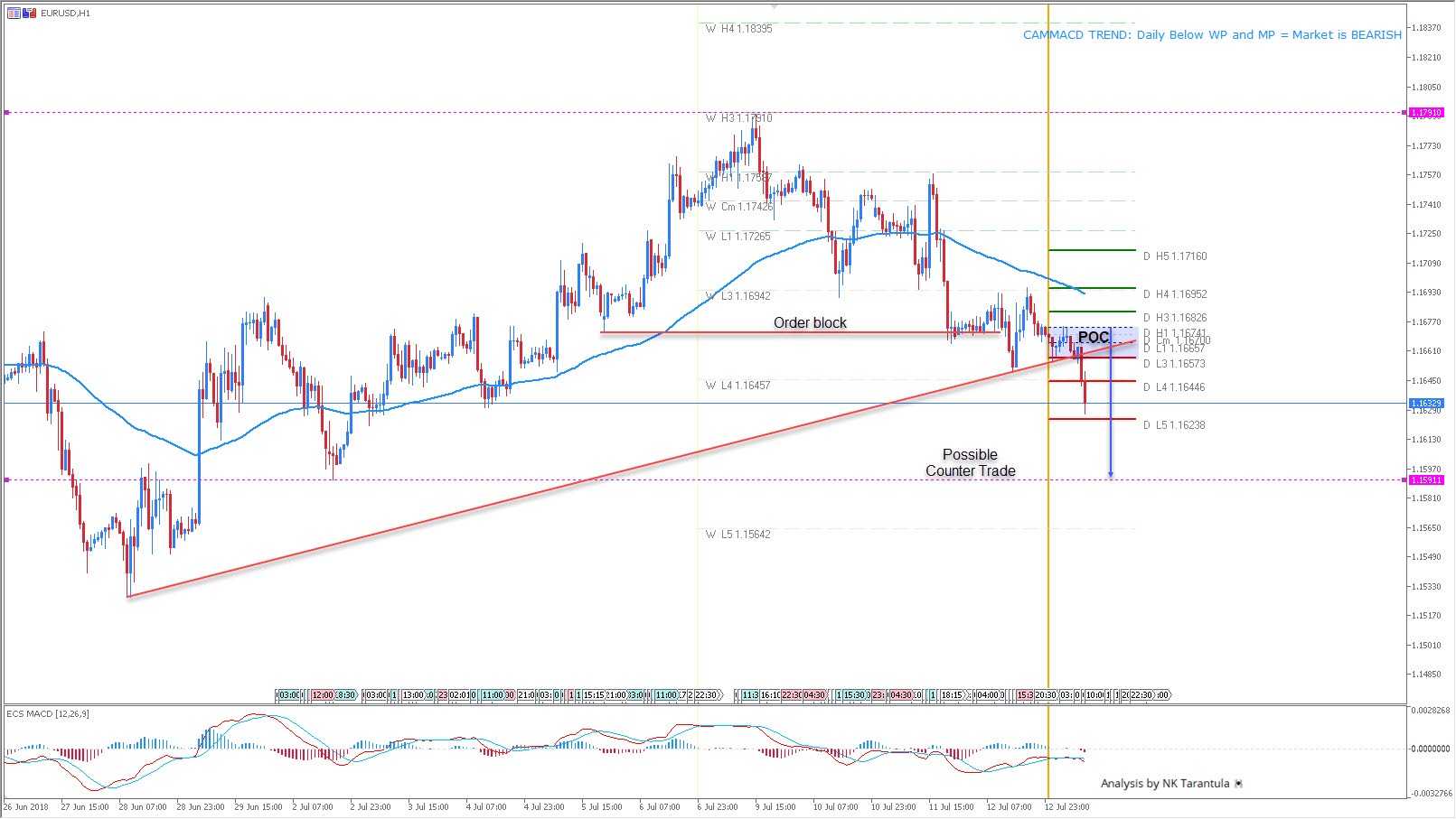
EURUSD Is Bearish Targeting 1.1560-90
The EUR/USD has made a bearish move and the intraday trend is bearish. However, this is looking like a range play and we might see a rejection if the price gets to 1.1590, eventually 1.1560. Interim range is 1.1790-1.1590. For short trades 1.1665-80 is the zone where fresh sellers are waiting and the first target is 1.1590. A profit taking between 1.1560-90 levels might turn the price up for 1.1680 retest.
W L3 - Weekly Camarilla Pivot (Weekly Interim Support)
W H3 - Weekly Camarilla Pivot (Weekly Interim Resistance)
W H4 - Weekly Camarilla Pivot (Strong Weekly Resistance)
D H4 - Daily Camarilla Pivot (Very Strong Daily Resistance)
D L3 – Daily Camarilla Pivot (Daily Support)
D L4 – Daily H4 Camarilla (Very Strong Daily Support)
POC - Point Of Confluence (The zone where we expect price to react aka entry zone)
EURUSD Bearish Wave C Tests Key 1.16 Support Zone
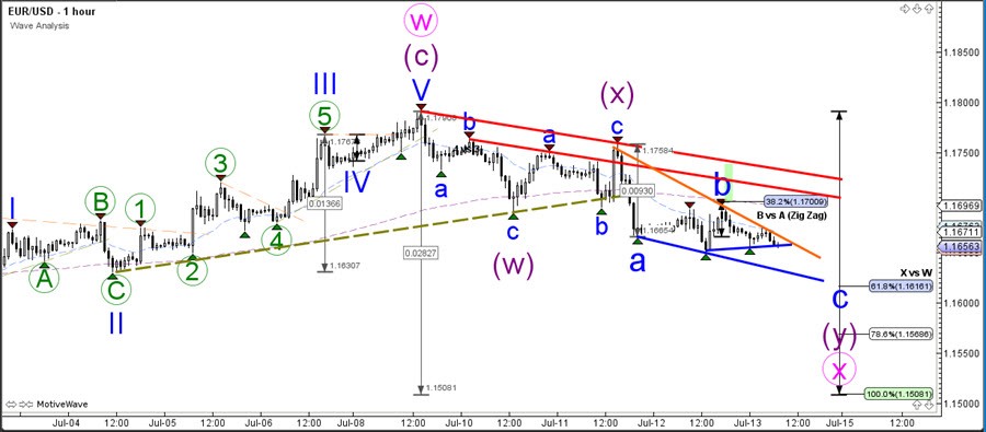
The EUR/USD price action seems slow and choppy, which is indicating a bearish corrective pattern rather than an impulse. This could confirm the expected WXY (pink) wave pattern and correction that is expected in wave B (purple).
The EUR/USD is now testing a key support zone which is indicated by the blue support trend line and Fibonacci levels of wave X vs W.
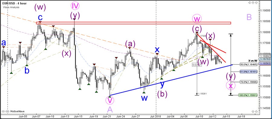
The EUR/USD is expected to make a bearish breakout to complete the bearish wave C (blue). If price goes beyond the 61.8-78.6% Fibonacci retracement level then a new downtrend is possible as well. Otherwise a correction seems more likely.
Breakout Trading: Methods & Tactics To Improve Your Chances of Success
What is Breakout Trading?
Breakout trading is simply where we look to capture an expansion in price as it moves beyond either a defined high point or a defined low point. This is the basis of breakout trading and as you will see, is extremely simple. So typically, traders will identify a trading range such as this one where prices are rotating between a high point and a low point and then will simply look to enter a trade as price breaks either above the high or below the low.
Now, one of the key elements to successful breakout trading is in how you identify the range. Correctly identifying the range will put you at an advantage. Some of the classic ways to identify ranges are based on identifying highs and lows over certain periods. Such as the daily high and low over the last 20 days. The last 20 trading days is roughly a month. Or alternatively, if you’re trading on the lower timeframes, identifying the highs and lows over the last trading day.
However, when you identify ranges, the key point is that you need to properly identify the support and resistance that frame the range. So, lets go a bit deeper.
Breakout with Trend
One of the first ways that we can improve the traditional breakout method is to look to trade with the trend only. So, essentially, when trading with this method, we look to identify an impulsive move in price followed by a consolidation, which forms a small range. We then look to play a breakout of the range in continuation of the trend. Trading in this manner keeps momentum on our side and gives us a far stronger chance of catching a proper move.
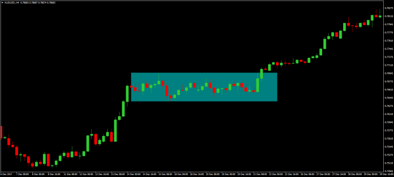
So, in this example you can see that price makes an explosive move higher before momentum stalls and we form a small block of consolidation giving us a brief range framed by these highs and these lows. So, knowing that the trend is bullish, we anticipate that price is going to break to the topside, so we set an order to buy above the high of the range. We then set our stop on the other side of the range (if this was a bearish trend we would have an order to sell below the low of the range with our stop above it) and our target is then a minimum of 2 x our stop, so, 2 x the width of the range.
Waiting For The Candle Close
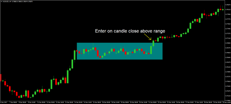
Now, one really important point to highlight here is how we actually enter a breakout. Many traders will enter a breakout trade as soon as price breaches the boundaries of the range, before the candle has closed. However, this is an extremely risky strategy because entering in this manner exposes you to the risk of catching a false breakout where price breaches the range before reversing back inside. To add more weight to our bias, we will only enter breakout trades on a candle close beyond the range boundary. So, in this instance where we are trading long, we need to see a candle close above the high of the range and vice versa for bearish trends. We would need to see a candle close below the low of the range to set a short trade.
Using Indicators
We can also use certain indicators to help us identify range situations and breakouts. One of the best indicators for this is the Bollinger band indicator. Hopefully you can remember Bollinger Bands from the session we did on it – if not make sure to take some time to go back over that one! – But basically, Bollinger bands are great for giving us a guide to the trend direction in the market as well as the volatility. The middle band is a 20 period moving average and the upper and lower bands mark 2 std deviations above the average and 2 std deviations below the average respectively. Now many people look to trade Bollinger bands simply by trading a breakout as price breaks through either the upper or lower Bollinger bands, however, this tends to be an ineffective way to trade them because price so often breaks the Bollinger bands only to reverse back inside them.
Instead, what we have to do is combine Bollinger bands with our understanding of support and resistance. This will give us a much better chance of catching a proper move. So essentially with this method we are looking to identify a range in price where the market is rotating between a high and low point. This will be clearly identified by the Bollinger bands which will be moving in rather a flat fashion, with price bouncing off the upper and lower bands. What we then want to identify is price breaching either the high or low of the range as well as breaking out of the Bollinger bands, to signal a shift in momentum.
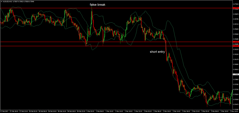
So, looking at this example you can see that price is framed clearly in a range between these high points here and these low points. Price is also clearly respecting the Bollinger bands, bouncing off the upper and lower bands. You can also see that instead of moving higher or lower, the Bollinger bands are simply moving in a sideways fashion – indicating the lack of momentum in the market.
However, at this point here we can note two things. One, price has broken down beneath the low of the range and secondly, price has broken out below the lower Bollinger bands. The confluence of these two elements confirms the bearish breakout and we would go ahead and sell on the close of the candle that closes here beneath both the range low and the Bollinger band low.
We mentioned earlier the importance of waiting for a candle close beyond the range boundary to avoid false breakouts. You can see clearly here an example of why this is such an important aspect of breakout trading because in this instance price shoots up breaking above the high of the range only to reverse sharply back inside and sell off down to the range low. If we had entered on the break of the high we would have been stopped out, whereas waiting for candle close keeps us out of trouble.
Dynamic Ranges
So far we have looked at how you can trade breakouts of static ranges, e.g ranges defined by a horizontal high and low. However, you can also trade breakouts of dynamic ranges. E.g ranges that are defined by a structure such as a channel. We previously covered trend lines in an earlier session, but you can refresh your memory at the next session. So, channels are essentially structures that form when price moves between two identical trend lines that form support and resistance. To identify a channel, we simply first establish a trend line and then clone it to apply it to the other side of price.
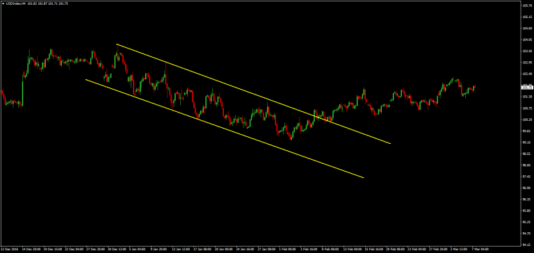
So, in this example you can see that we have a clear bearish trend line formed from joining this high point with this lower high. We can then take that trend line and apply it to the underside of price and you can see that it perfectly captured the swing lows. So, we have a clear bearish channel in play here with price trending lower rotating between the upper and lower trend lines. As we see a channel like this developing we can be on the lookout for the opportunity to trade a reversal as price breaks out of the channel as it did here. You can see that after holding the channel for over a month price eventually broke out of the topside of the channel and traded higher.
Channel breaks can be a fantastic way to catch reversals in trends and the way that we enter trades on channel breaks is the same as how we enter breaks of typical ranges. We wait for a candle close outside of the range, so in this instance you can see that price broke out of the range here with this large bullish candle and closed above the bearish channel resistance line giving us our long entry.
Now, when it comes to trading channel breaks one of the ways that we can increase our chances of success to use indicators to highlight potential reversals. Using an indicator such as RSI can help us spot when momentum is waning in the channel and the market is vulnerable to a reversal. So, looking at this example again with the RSI indicator on this time we can see clear bullish divergence.
You should be really familiar with this term by now but, just to make sure, divergence is when moves in prices aren’t supported by the indicator.
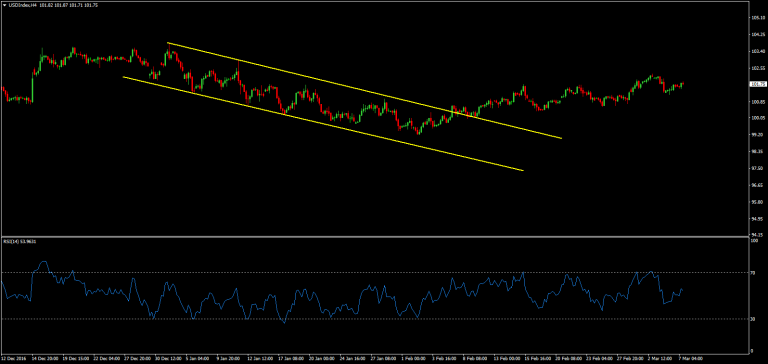
So, in this instance we can see that price is trending lower in the channel however from this point here you can see that the indicator is starting to put in higher lows indicating waning bearish momentum. So, once we identify a channel such as this we then want to keep an eye on the RSI indicator and once we start to see divergence. We then know that a reversal is likely and so we know to keep a closer eye on the setup as it develops.
Again, as with trading the range breakout in the direction of the trend, the best way to operate this strategy is where the channel forms as a correction to a trend and then the break signals the resumption of the trend. Breakout trading in this manner can be a powerful way to enter a trending market at a great level.
Three Price Chart Types That You Should Start Using
A price chart is probably the most important piece to the puzzle when it comes to trading the financial markets. While fundamentals drive the price of the instrument, without a price chart to look at, it would be a herculean task to trade the financial markets.
Ask any trader about the price chart that they use, and the most common response would be the candlestick chart or the bar chart. Some might even refer to the Heikin Ashi chart. The line chart is most often ignored or least used by day traders.
However, looking beyond the surface, there are quite a few chart types that are very unique. In fact, these chart types have a common denominator, which is the fact that time is excluded. These “time-independent charts” or pure price charts offer a completely different view of the markets.
The three time-independent chart types
The three most commonly used time-independent chart types are:
- Renko Charts
- Kagi Charts
- Range bars
Let’s explore each of these unique chart types.
Renko Charts
Renko charts are visually distinctive from all other chart types. Coming from the Japanese word, Renga or brick, the Renko charts are brick type charts that print a new bullish or a bearish brick depending on the number of pips price moves.
The chart below shows a 25 pip EURUSD Renko chart.
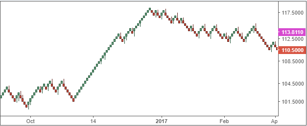
When looking at the Renko chart, the only aspect to consider is the price plotted on the y-axis. Based on the number of pips that each brick is set for, you can expect to see a new bullish Renko brick being printed when price moves ‘x’ pips in the same direction.
A reversal Renko is plotted when price moves two times the ‘x’ pips in the opposite direction. Therefore, every ‘x’ pip move in the bearish direction prints a new bearish Renko.
Many technical analysts look at this unique chart type as a means to analyze pure price action. It is often said that noise that is prevalent in most of the time-based charts is absent. However, you can still see some sideways range being shown on the Renko chart as well.
Kagi Charts
Kagi charts are also based only on price and are independent of time. These charts stand out as vertical lines colored based on bullish or bearish price action with a connection to each of these vertical lines.
The next chart below shows an example of a Kagi chart.
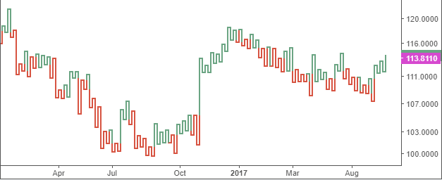
The name Kagi is the Japanese word for a wood block and is based on the ‘key’ or the L-shaped tool used to align paper or to align sharp edges. Kagi charts are therefore also referred to as key charts. Another reference is the yin and the yang lines.
The yin line is when price action is bearish, and the yang line is where price action is bullish.
When price moves at a user-defined level, the bullish or bearish Kagi’s are formed. However, when price exceeds this user-defined level in the opposite direction, a horizontal line is plotted followed by a new reversal bullish or a bearish Kagi.
Kagi charts are probably the easiest of chart types to interpret price action. With the Kagi charts, price action needs to undergo a significant change of direction in order to print a new reversal Kagi.
Range bars
Range bars, unlike Renko or Kagi charts, are a product of the Brazilian trader Vicente Nicolellis. Range bars were developed in the mid-90’s and are relatively new considered to the ancient Renko and Kagi charts.
However, despite the uniqueness, range bars also take price into consideration and remain independent of time. Each range bar represents a specified price movement. Range bars follow three simple rules.
- Each range bar has a high and low that is equal to the range specified by the user
- A new range bar opens when price moves above the specified level
- A range bar closes at the previous high or the low
The chart below shows an example of a range bar.
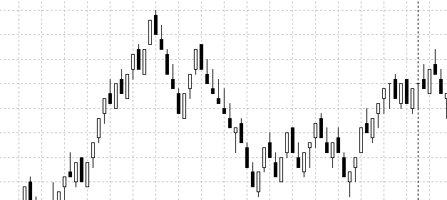
What you can see is that Range bars look in some aspect to be similar to the Renko charts. However, that is where the similarity ends. With range bars, every bar is equal in range.
Range bars were designed by Nicolellis for the specific purpose of trading volatility. Thus, ranging price action can be easily identified when using this chart type.
Besides the above, other unique chart types include the Point and Figure Chart and the three line break chart. In the next section of this article, we will explore in more detail about each of these chart types and the information they offer for day traders.
What are Range Bars? Trading Strategies Using the Range Bar
Range bars belong to a type of chart that is independent of time. Unlike the more conventional chart types such as the candlestick and bar charts, with Range bars, only the horizontal price level is plotted. Time is redundant.
Range bars were designed by a Brazilian trader, Vincent Nicolellis in the 1990’s. This unique chart type was conceptualized after Nicolellis spend decades running the Brazilian trading desk. Due to the volatility of the markets at the time, Nicolellis believed that price was the most important aspect when analyzing a security.
Thus, range bars were designed as they removed the equation of time from the charts. As the name suggests, range bars are specifically used to identify ranging price action and trending price action. Although relatively new when compared to the other chart types, range bar based trading strategies and analysis have quickly caught on.
Below is an example of a range bar chart.
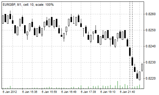
Example of a Range bar with 10 pip setting
However, most of the existing trading platforms have not yet incorporated the range bars as one of the default chart types. But there are a lot of workarounds including on the MT4 trading platform.
Traders can make use of one of the many available range bar EA’s in order to build these charts and trade off them.
How do range bars calculate price?
Because range bars consider only price, the main variable when setting up the range bars is the price level. For example, a 10 pip range bar will define that every bar has a range of 10 pips when measured from high to low.
With time not coming into the equation, a range bar can continue to unfold until price breaks above the range.
Range bars follow three simple rules
- Each bar has a high and low that is defined based on the input price level
- A new range bar opens outside the high or the low of the previous bar
- A range bar closes at the high or at the low
The above chart shows a 10 pip EURGBP range bar. The high and low of each bar in this chart is 10 pips. A new range bar opens only when price closes above or below the previous range bar’s high or low.
Trading strategies using the Range bar
On closer observation, one can see that numerous trading strategies that are unique to Range bars can be developed. The simplest of all, however, is based on price action methods such as support and resistance, trend lines and of course the range bar patterns itself.
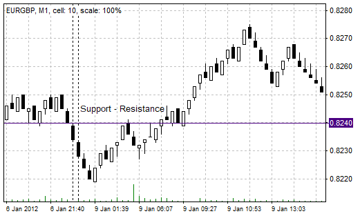
Support/Resistance trading with Range bars
When trading with the range bar, it is important to choose the right pip value, for example when trading the forex markets. Traders should take into account the spread of the instrument. Setting too small a range bar level could result in losses.
The chart above shows a simple support/resistance example using the range bars. As you can see, price action is quite straightforward when trading with range bars, bringing simplicity to the trading methods.
While there is no straightforward way to find the right pip value for the range bar based on the instrument you are trading, you can of course experiment. Most of the forex majors can have a range bar value of 15 – 20 pips and higher. This allows traders to build intraday trading strategies that also take into account the spread of the instrument as well.
In conclusion, range bars can offer traders a unique perspective on the markets. This chart type can be very beneficial for forex intraday traders as it can help traders to understand price action more clearly, eliminating noise but at the same time highlighting volatility.
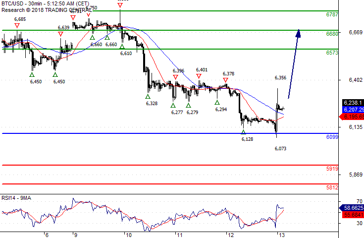
Bitcoin/Dollar The Upside Prevails As Long As 6099 Is Support
6099 is our pivot (invalidation) point.
Our preference The upside prevails as Long as 6099 is support.
Alternative scenario Below 6099, expect 5919 and 5812.
Comment The RSI is above its neutrality area at 50. The MACD is positive and above its signal line. The configuration is positive. Moreover, the pair is above its 20 and 50 MAs (respectively at 6196 and 6208).
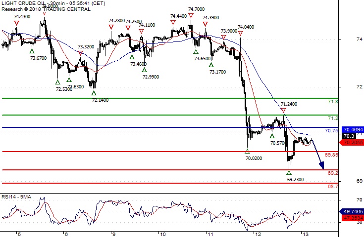
Crude Oil Key Resistance At 70.75
Pivot (invalidation): 70.75
Our preference Short positions below 70.75 with targets at 69.85 & 69.20 in extension.
Alternative scenario Above 70.75 look for further upside with 71.20 & 71.80 as targets.
Comment As Long as the resistance at 70.75 is not surpassed, the risk of the break below 69.85 remains high.
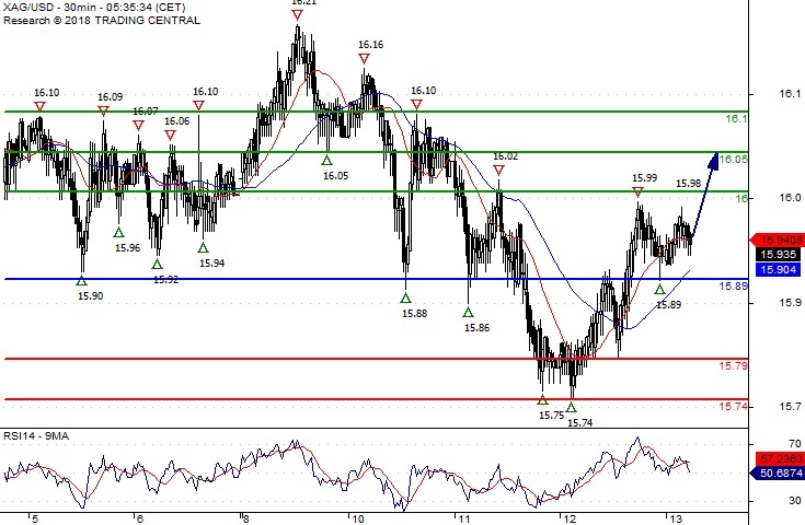
Silver Spot Further Upside
Pivot (invalidation): 15.8900
Our preference Long positions above 15.8900 with targets at 16.0000 & 16.0500 in extension.
Alternative scenario Below 15.8900 look for further downside with 15.7900 & 15.7400 as targets.
Comment The RSI is mixed to bullish.
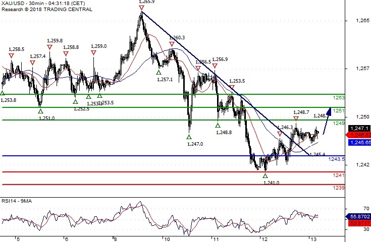
Gold Spot Rebound Expected
Pivot (invalidation): 1243.50
Our preference Long positions above 1243.50 with targets at 1249.00 & 1251.00 in extension.
Alternative scenario Below 1243.50 look for further downside with 1241.00 & 1239.00 as targets.
Comment The RSI is mixed to bullish.