Sample Category Title
Trump Cancels Planned Attacks on Iran, Stocks Rally: Market Reactions
Markets were aggressively pricing in a violent restart of hostilities between the United States and Iran following this morning's firm rejection of the latest Iranian diplomatic proposal.
However, the geopolitical landscape just experienced a significant shift: President Trump has officially called off the planned offensives, signalling a pivot toward a more strategic, diplomatic approach.
According to the president’s own Truth Social post, Trump was scheduled to meet with his war cabinet tomorrow to discuss the next immediate military strike. Instead, he announced that he is halting the planned attack on Iran at the direct request of the Crown Prince of Saudi Arabia and the President of the UAE.
The regional leaders urged the US to hold off on military action, citing that serious, high-level negotiations are currently taking place behind the scenes.

Trump's Truth Social post. May 18, 2026.
This sudden de-escalation is sparking a huge relief rebound across global financial markets. After a notably rough start to the trading week, heavily clouded by the latest Iran proposition rejection and the Warsh trade/Federal Reserve repricing, investor sentiment is rapidly bouncing back.
US stock benchmarks are aggressively catching a bid, reversing earlier intraday losses as the removal of immediate military tail risks allows buyers to confidently step back into the fold. On the other hand, oil, which quickly rebounded above the $100 mark, is now seeing some heavier selling flows.
While structural macroeconomic concerns remain, the diplomatic news provides a sweet safety net that market bulls desperately needed to regain their footing.
Let’s dive into a few key charts to see how the latest news affected markets.
Stock Markets Bounce Significantly
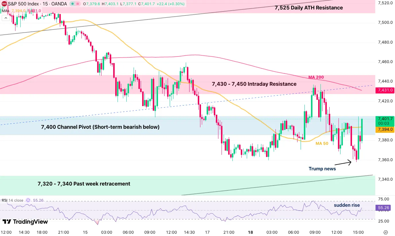
S&P 500 CFD 15M chart. Source: TradingView, May 18, 2026, 15:45.
The S&P 500 erased most of its daily losses, retesting the 7,400 level only a few hours after breaking it to the downside.
Energy Markets
WTI US oil prices exploded to new highs, close to $110 in CFD prices, this morning but are now back below the 15M 50-period MA on strong selling momentum.
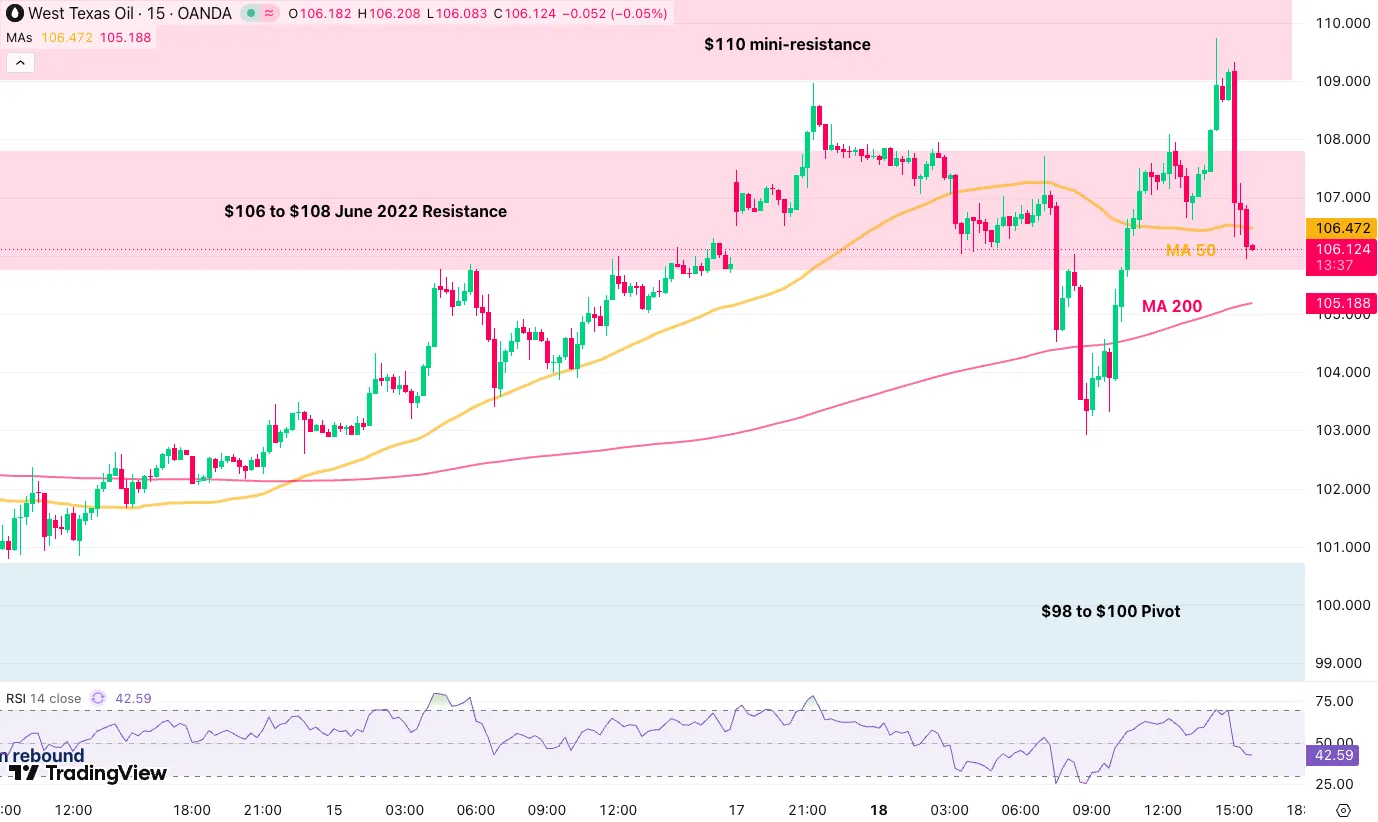
WTI US Oil CFD 15M chart. Source: TradingView, May 18, 2026.
WTI Technical Levels:
Resistance Levels
- 15M 50-period MA 106.47
- $106 to $108 June 2022 resistance, rejecting
- $110 mini-resistance
- 2022 and Monday highs $117 to $120, larger channel top
Support Levels
- $105 15M 200-period MA
- $98 to $100 pivot
- Momentum support $93 to $95
- $90 psychological level and past session's lows
- $87 to $90 mini-support
- $82 Friday 17 lows
- 2025 highs key support $78 to $80
Metals Markets
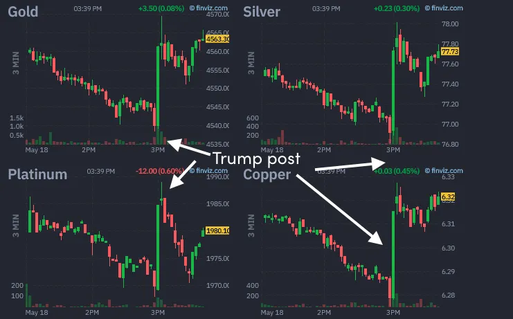
Metal futures intraday charts. Source: Finviz, May 18, 2026.
Metals are somewhat bouncing higher again from the better market narratives, with Copper and Silver leading the way to the upside.
The reaction is still quite contained for now.
US Dollar
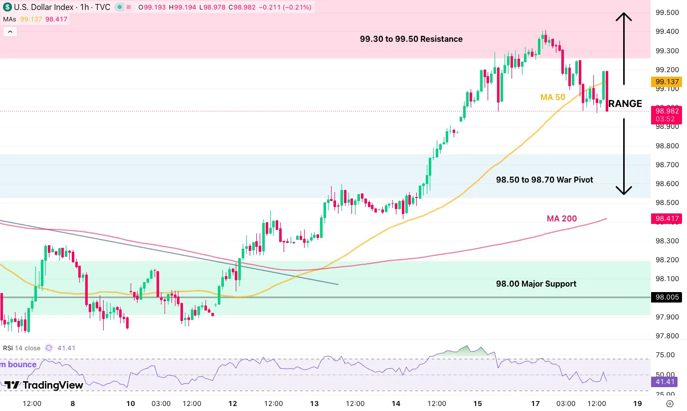
Dollar Index, DXY, 1H chart. Source: TradingView, May 18, 2026.
The US Dollar is seeing heavy rejection, failing to hold above its 50-hour MA and instantly tumbling back below 99.00.
Safe trades and keep track of the latest headlines.
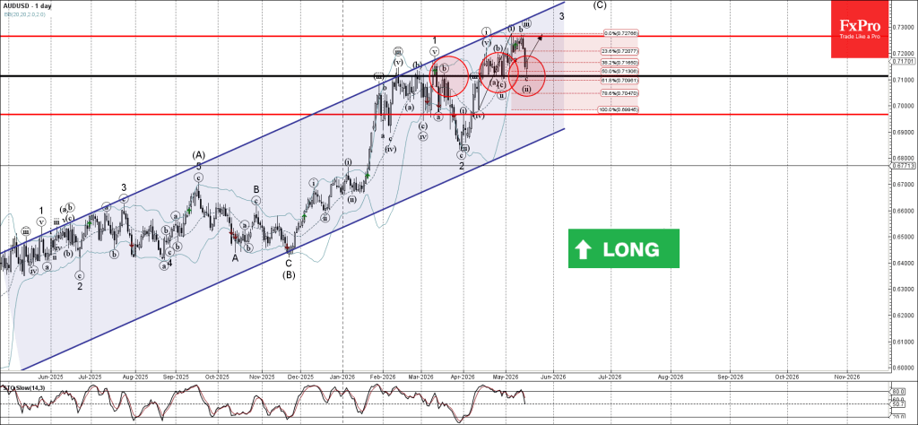
AUDUSD Wave Analysis
AUDUSD: ⬆️ Buy
- AUDUSD reversed from pivotal support level 0.7110
- Likely to rise to resistance level 0.7265
AUDUSD currency pair recently reversed up from the pivotal support level 0.7110, which has been reversing the price from April.
The support level 0.7110 was also strengthened by the lower daily Bollinger Band and by the 61.8% Fibonacci correction of the upward impulse from April.
Given the strong daily uptrend, AUDUSD currency pair can be expected to rise to the next resistance level 0.7265 – which stopped waves i and b.
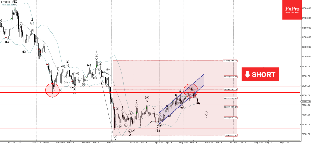
Bitcoin Wave Analysis
Bitcoin: ⬇️ Sell
- Bitcoin reversed from resistance zone
- Likely to fall to support level 75000.00
Bitcoin cryptocurrency recently reversed from the resistance zone between the resistance 81500.00 (former multi-month support from November), upper daily Bollinger Band and the resistance trendline of the daily up channel from March.
This resistance zone was also strengthened by the 61.8% Fibonacci correction of the downward impulse from January.
Bitcoin cryptocurrency can be expected to fall to the next support level 75000.00 – former strong resistance from March and low of earlier correction iv.
Eco Data 5/19/26
| GMT | Ccy | Events | Act | Cons | Prev | Rev |
|---|---|---|---|---|---|---|
| 22:45 | NZD | PPI Input Q/Q Q1 | 1.40% | 0.80% | -0.50% | |
| 22:45 | NZD | PPI Output Q/Q Q1 | 0.80% | 0.50% | 0.10% | |
| 23:50 | JPY | GDP Q/Q Q1 P | 0.50% | 0.40% | 0.30% | |
| 23:50 | JPY | GDP Deflator Y/Y Q1 P | 3.40% | 3.10% | 3.40% | |
| 00:30 | AUD | Westpac Consumer Confidence May | 3.50% | -12.50% | ||
| 01:30 | AUD | RBA Meeting Minutes | ||||
| 04:30 | JPY | Industrial Production M/M Mar F | -0.40% | -0.50% | -0.50% | |
| 04:30 | JPY | Tertiary Industry Index M/M Mar | -0.20% | -0.40% | -0.40% | -0.70% |
| 06:00 | GBP | Claimant Count Change Apr | 26.5K | 27.3K | 26.8K | 4.9K |
| 06:00 | GBP | ILO Unemployment Rate (3M) Mar | 5.00% | 4.80% | 4.90% | |
| 06:00 | GBP | Average Earnings Including Bonus 3M/Y Mar | 4.10% | 3.70% | 3.80% | 3.90% |
| 09:00 | EUR | Eurozone Trade Balance (EUR) Mar | 3.5B | 6.5B | 7.0B | 6.5B |
| 12:30 | CAD | Building Permits M/M Mar | 10.30% | 3.80% | -8.40% | -7.80% |
| 12:30 | CAD | New Housing Price Index M/M Apr | -0.40% | 0.00% | -0.20% | |
| 12:30 | CAD | CPI M/M Apr | 0.40% | 0.70% | 0.90% | |
| 12:30 | CAD | CPI Y/Y Apr | 2.80% | 3.10% | 2.40% | |
| 12:30 | CAD | CPI Common Y/Y Apr | 2.50% | 2.60% | 2.60% | |
| 12:30 | CAD | CPI Median Y/Y Apr | 2.10% | 2.20% | 2.30% | |
| 12:30 | CAD | CPI Trimmed Y/Y Apr | 2.00% | 2.30% | 2.20% | |
| 14:00 | USD | Pending Home Sales M/M Apr | 1.40% | 1.60% | 1.50% | 1.70% |
| 22:45 | NZD |
| PPI Input Q/Q Q1 | |
| Actual | 1.40% |
| Consensus | 0.80% |
| Previous | -0.50% |
| 22:45 | NZD |
| PPI Output Q/Q Q1 | |
| Actual | 0.80% |
| Consensus | 0.50% |
| Previous | 0.10% |
| 23:50 | JPY |
| GDP Q/Q Q1 P | |
| Actual | 0.50% |
| Consensus | 0.40% |
| Previous | 0.30% |
| 23:50 | JPY |
| GDP Deflator Y/Y Q1 P | |
| Actual | 3.40% |
| Consensus | 3.10% |
| Previous | 3.40% |
| 00:30 | AUD |
| Westpac Consumer Confidence May | |
| Actual | 3.50% |
| Consensus | |
| Previous | -12.50% |
| 01:30 | AUD |
| RBA Meeting Minutes | |
| Actual | |
| Consensus | |
| Previous | |
| 04:30 | JPY |
| Industrial Production M/M Mar F | |
| Actual | -0.40% |
| Consensus | -0.50% |
| Previous | -0.50% |
| 04:30 | JPY |
| Tertiary Industry Index M/M Mar | |
| Actual | -0.20% |
| Consensus | -0.40% |
| Previous | -0.40% |
| Revised | -0.70% |
| 06:00 | GBP |
| Claimant Count Change Apr | |
| Actual | 26.5K |
| Consensus | 27.3K |
| Previous | 26.8K |
| Revised | 4.9K |
| 06:00 | GBP |
| ILO Unemployment Rate (3M) Mar | |
| Actual | 5.00% |
| Consensus | 4.80% |
| Previous | 4.90% |
| 06:00 | GBP |
| Average Earnings Including Bonus 3M/Y Mar | |
| Actual | 4.10% |
| Consensus | 3.70% |
| Previous | 3.80% |
| Revised | 3.90% |
| 09:00 | EUR |
| Eurozone Trade Balance (EUR) Mar | |
| Actual | 3.5B |
| Consensus | 6.5B |
| Previous | 7.0B |
| Revised | 6.5B |
| 12:30 | CAD |
| Building Permits M/M Mar | |
| Actual | 10.30% |
| Consensus | 3.80% |
| Previous | -8.40% |
| Revised | -7.80% |
| 12:30 | CAD |
| New Housing Price Index M/M Apr | |
| Actual | -0.40% |
| Consensus | 0.00% |
| Previous | -0.20% |
| 12:30 | CAD |
| CPI M/M Apr | |
| Actual | 0.40% |
| Consensus | 0.70% |
| Previous | 0.90% |
| 12:30 | CAD |
| CPI Y/Y Apr | |
| Actual | 2.80% |
| Consensus | 3.10% |
| Previous | 2.40% |
| 12:30 | CAD |
| CPI Common Y/Y Apr | |
| Actual | 2.50% |
| Consensus | 2.60% |
| Previous | 2.60% |
| 12:30 | CAD |
| CPI Median Y/Y Apr | |
| Actual | 2.10% |
| Consensus | 2.20% |
| Previous | 2.30% |
| 12:30 | CAD |
| CPI Trimmed Y/Y Apr | |
| Actual | 2.00% |
| Consensus | 2.30% |
| Previous | 2.20% |
| 14:00 | USD |
| Pending Home Sales M/M Apr | |
| Actual | 1.40% |
| Consensus | 1.60% |
| Previous | 1.50% |
| Revised | 1.70% |
Sunset Market Commentary
Markets
Core bonds took a breather after last week’s violent selloff. Japanese markets this morning suggested otherwise though. The long end was pressured strongly with yields rising up to 20 bps at some point on a combination of another increase in oil prices and the Takaichi administration considering an extra debt-funded budget for relief measures. Net daily changes were capped at around 9 bps (40-yr) eventually. European investors showed little appetite to build on that early Asian oil price gains (of as much as 2.5% to $112/b). The price of the black gold was already easing marginally before a report of the semi-official Iranian Tasnim news agency accelerated the drop. It said that the US is proposing a temporary waiver on the oil sanctions that it imposes on the country, which would remain in place until a final deal is reached. The news follows after US president Trump in recent days raised pressure on Iran, saying it “better get moving, FAST, or there won’t be anything left of them.” Leaks cited by Al Arabiya further said “Iran is seeking a long, multi-stage truce and a gradual, secure reopening of the Strait of Hormuz as part of a revised proposal. The report said Tehran is prepared to accept a long-term nuclear freeze instead of full dismantlement and wants enriched uranium transferred unconditionally to Russia rather than the US.” A barrel of Brent is currently trading around $108 barrier. That’s offering Bunds some respite. Front end yields ease 4 bps. Treasury yields are down less than 2 bps. Gilts outperform with net daily changes varying between -7 and -7.5 bps across the curve. UK bonds were hit the hardest in the recent global rout with politics entering a toxic cocktail of inflation and fiscal worries. Today’s minor recovery allows sterling to claw back as well. EUR/GBP retreats to around 0.87. GBP/USD bounces back towards 1.34. Most other major USD pairs see downward pressure on the dollar side of the equation. EUR/USD snaps a four-day losing streak by appreciating to 1.165. USD/JPY pared most of the early (Asian) gains to change hands nearly unchanged around 158.7. Stock markets rebounded on the (unconfirmed) geopolitical rumours. The EuroStoxx50 turned losses into a 0.6% gain. Wall Street opens flat.
News & Views
Inflation expectations among Swedish money market players eased in May compared to April, the Origo Group survey showed today. Respondents’ annual inflation expectations for the 1-y horizon moderated to 1.6% from 1.7%. Expectations on CPIF inflation (with fixed interest rate) also declined for the 2-y (1.9% from 2.1%) and the 5-y (2% from 2.2%) horizon. Growth expectations barely changed with 1-year ahead GDP growth seen at 2.2% and 2-year ahead growth at 2.3%. Respondents see the policy rate at 1.9% in a 1-y horizon and at 2.1% (from 2.2%) at a 24-months horizon. The survey comes as recent ‘hard’ inflation data for both CPIF inflation and the core measure in April printed at very low levels at respectively -0.6% M/M and 0.8% Y/Y and -0.8% M/M and 0.1% Y/Y. The low inflation level was at least partially due to a decline in VAT on food at the start of April. Still, readings well below target bought the Swedish Riksbank time to assess the impact of higher energy prices. The RB kept a guarded approach leaving the policy rate at 1.75% on May 7. It ‘guided’ that ‘the current level of the policy rate gives the Riksbank a good initial position to adjust monetary policy if required to safeguard the inflation target.’ Markets only discount a 25 bps hike by September. The krone recently traded defensively with EUR/SEK again nearing the 11 mark.
The Swiss State Secretariate of Economic Affairs revealed GDP growth (adjusted for sports events) accelerating to a quarterly pace of 0.5%, compared to 0.2% in Q4 of last year. Markets expected a more modest 0.4%. The flash estimated didn’t provide much details, but the report indicates that both industrial and services sectors contributed to growth. More detailed growth figures are expected to be published early June. After testing the EUR/CHF 0.90 barrier in the early stages of the conflict in the Middle East, the Swiss franc in the second half of March lost some modest ground as the SNB reiterated its preparedness to intervene in the FX market as necessary. EUR/CHF since end March holds a range between 0.9265 and 0.913 and currently again trades near the bottom of that range (stronger side for the CHF).
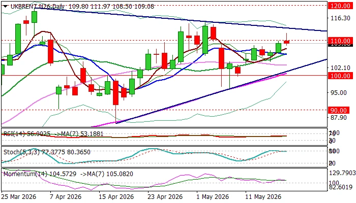
Brent Oil Hit Two-Week High But Faces Strong Headwinds at $110 Zone
Brent oil price spiked to two-week high in early Monday trading, extending last week’s 4.5% advance, driven by fragile situation in the Middle East and fading prospects for peace after the latest attack on a nuclear power plant in the UAE.
Fresh extension of the bull-leg from $96.09 (May 7 higher low) probed through psychological $110 barrier and peaked at $111.97, but quick easing below $110 signals that bulls might be running out of steam.
Fading positive momentum and overbought Stochastic on daily chart contribute to scenario of limited profit-taking and positioning for fresh push higher (if fundamentals do not improve).
Dips should ideally find solid ground at 106.20/105.80 zone (Friday’s low / converged 10/20DMAs) to provide better levels to re-enter bullish market for sustained break above $110 and possible acceleration towards $115.26 (May 4 peak), guarding key barriers at $120 zone.
Caution on loss of supports at $106 zone that would risk deeper pullback and expose daily Tenkan-sen ($104.02) and daily cloud top ($102.33).
Res: 111.59; 111.97; 113.82; 114.41.
Sup: 108.50; 106.72; 105.80; 104.02.
IMF Says BoE Must Be Ready to Move Rates “in Either Direction” as Energy Shock Clouds Outlook
The International Monetary Fund upgraded its 2026 UK growth forecast on Monday but warned that the Bank of England must remain ready to adjust interest rates “in either direction” as the Middle East energy shock complicates the inflation outlook.
In its latest UK assessment, the IMF raised its forecast for UK growth this year from 0.8% to 1.0%, citing the economy’s resilience in recent years, though it cautioned that the war in the Middle East was weighing on near-term prospects through higher energy costs and weaker activity.
The IMF said monetary policy should remain restrictive to prevent rising energy prices from spilling over into core inflation and wage growth. At the same time, it acknowledged that the surge in oil and energy costs would likely lift headline inflation temporarily while simultaneously dampening output, creating a difficult balancing act for policymakers. The fund warned that “exceptional uncertainty” surrounding the geopolitical situation meant the BoE should retain flexibility to respond "in either direction" depending on how inflation dynamics evolve.
The IMF expects inflation to return to the BoE’s 2% target only by end-2027 under the current energy price outlook, around a year later than previously anticipated. It said holding rates steady for the remainder of this year should be sufficient if energy prices stabilize, while growth is projected to recover gradually in the second half of 2027 as the shock dissipates.
However, the IMF also emphasized that the BoE should be prepared to “respond forcefully” if second-round inflation effects become more entrenched than expected, highlighting the growing risk that the current oil shock could evolve into a more persistent inflation problem.
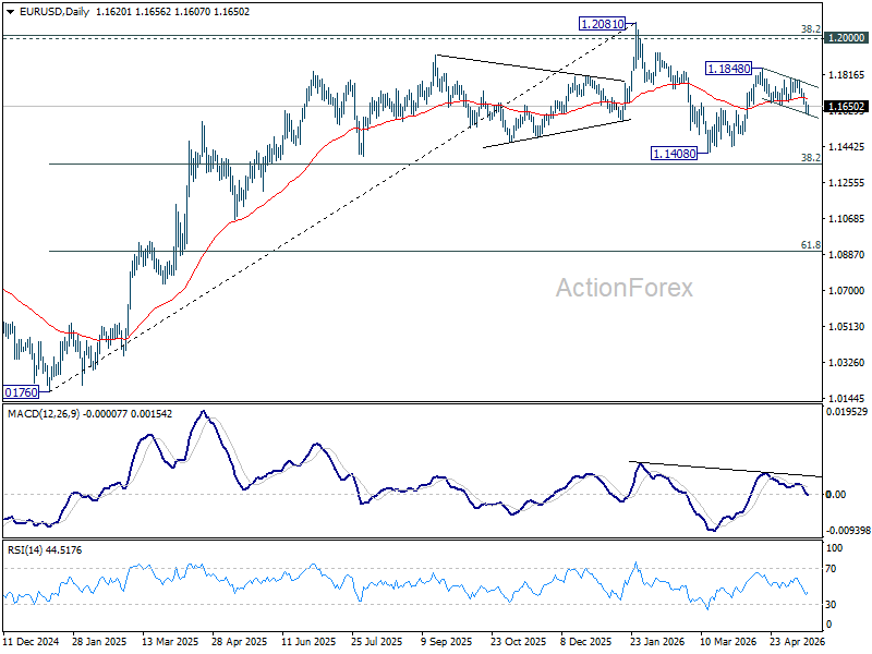
EUR/USD Mid-Day Outlook
Daily Pivots: (S1) 1.1603; (P) 1.1637; (R1) 1.1658; More….
Intraday bias in EUR/USD is turned neutral with current recovery, and some consolidations could be seen above 1.1607 temporary low. Risk will stay on the downside as long as 55 4H EMA (now at 1.1700) holds. Rebound from 1.1408 could have completed as a corrective three-wave move. Break of 1.1607 will bring deeper fall to retest 1.1408 low. However, sustained break of the EMA will dampen this bearish view and bring stronger rise back to retest 1.1848 instead.
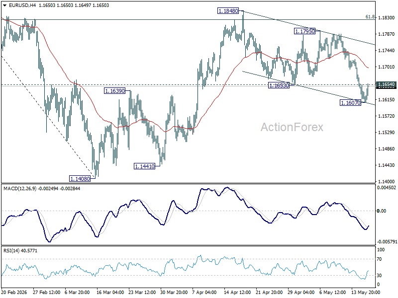
In the bigger picture, the strong support from 38.2% retracement of 1.0176 to 1.2081 at 1.1353 suggests that the pullback from 1.2081 is more likely a corrective move. Strong support was also found in 55 W EMA (now at 1.1542). Focus is back on 1.2 key cluster resistance level. Decisive break there will carry long term bullish implications. Nevertheless, break of 1.1408 support will revive the case of medium term bearish trend reversal.
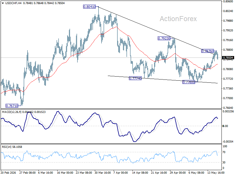
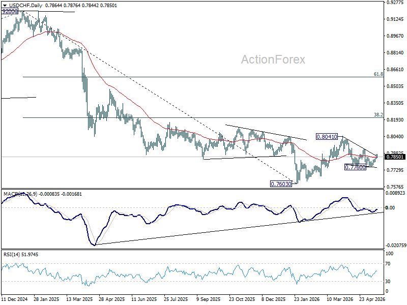
USD/CHF Mid-Day Outlook
Daily Pivots: (S1) 0.7839; (P) 0.7856; (R1) 0.7884; More….
Intraday bias in USD/CHF is turned neutral first with current retreat. Some consolidations could be seen below 0.7876 temporary top. Risk will stay on the upside as long as 0.7760 support holds. Above 0.7876 will target 0.7923 first. Firm break there will argue that fall from 0.8041 has completed as a three wave correction, and bring further rise to retest this high.
In the bigger picture, as long as 55 W EMA (now at 0.8035) holds, fall from 0.9200 is expected to continue, as part of the larger down trend. Firm break of 0.7603 will target 100% projection of 1.0146 (2022 high) to 0.8332 from 0.9200 at 0.7382.
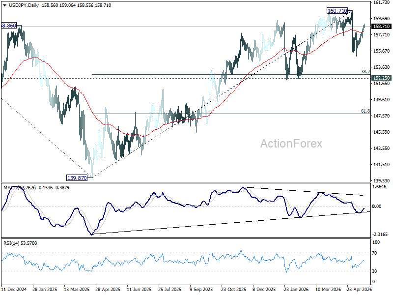
USD/JPY Mid-Day Outlook
Daily Pivots: (S1) 158.35; (P) 158.59; (R1) 158.99; More...
Intraday bias in USD/JPY remains on the upside at this point. Rise from 155.01 should target 160.71 high. But strong resistance is expected from there to start the third leg of the near term corrective pattern. On the downside, break of 157.30 minor support will argue that the third leg could have started, and target 155.01 support instead.
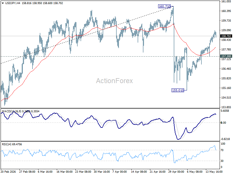
In the bigger picture, for now, corrective pattern from 161.94 (2024 high) is still seen as completed at 139.87. Rise from there is seen as resuming the long term up trend. So, break of 161.94 is expected at a later stage to resume the long term up trend. However, sustained break of 55 W EMA (now at 154.36) will dampen this view and bring deeper fall back towards 139.87 to extend the pattern from 161.94.